By Kirk Demarais / March 6, 2017
 The world of The Brady Bunch can be defined by a conspicuous style. After all, the setting is an architect father’s passion project, accoutered with what Carol Brady once described as Danish Modern furniture. The family’s fashion arc went from Ozzie and Harriet in season one to post-sixties extremes in season three. Yet the Brady’s choice of household artwork seems oddly uninspired. Apart from a few exceptions, Brady wall art is practically invisible, begging to be upstaged by Mike’s designs, which include both the house and the family that lives there. What follows is an examination of that which is meant to be ignored.
I’ve detailed the Brady family art collection and elaborated on the trends and styles that it represents. It began as a lark, but it became a personal opus that surpassed the simple room-by-room inventory I envisioned. In some cases specific artists, pieces, and manufacturers have been unearthed, filling a gaping informational void on the internet. My work is sure to be a treat for anyone who loves art, or The Brady Bunch, or tedious overanalysis.
To point out the generic nature of the Brady’s artistic taste isn’t to say they weren’t on trend. After World War II, art was industrialized like never before in order to meet the demand for something to cover the walls of tens of thousands of new American homes. Companies like Turner Wall Accessory produced and reproduced hundreds of prints with the home decor market in mind. During this era, original art was often replicated by an assembly line of contract artists working under shared pseudonyms. The subjects were intentionally innocuous in contrast to the art world at large, where bold personalities emerged to break every conceivable convention. Like most Americans, the Brady’s humble art collection largely consists of commercially produced prints. This makes the family seem real and relatable to the viewer—until you remember that they have a live-in housemaid.
The production designers didn’t construct the Brady aesthetic from scratch. According to the The Brady Bunch Blog, the sets are full of props and artwork that previously appeared in other Paramount-produced television shows. There’s little chance of finding intentional parallels between the characters and their surroundings, but that needn’t stop us from applying our own meaning. It’s also worth noting that much of the art is repeatedly repositioned throughout the course of the show. It is unclear whether this is the result of less-than-vigilant set dressers or a class five haunting.

Top: living room horse sculpture; bottom left: horse painting at the top of the stairs; bottom right: horse statuette in the family room
The Living Room
The horse statue is perhaps the most iconic piece on the series because of its noticeable spot in the main room. Its onscreen career rivals that of many actors. Prior to the Bradys, the prop showed up in the film Bell, Book, and Candle (1958), as well as the TV series Bewitched (1964-1972). After its role on The Brady Bunch, it appeared on Mannix in 1975 (on which Robert Reed, who played Mike Brady, was also a regular.) The horse emerged again in the 1981 spin-off The Brady Brides before finding its way back to the base of the stairs in the 1990 dramedy The Bradys. The quickly-cancelled series portrayed Marcia as an alcohol abuser, Peter as a womanizer, and Bobby as a paralyzed race car driver—and it still had a laugh track.
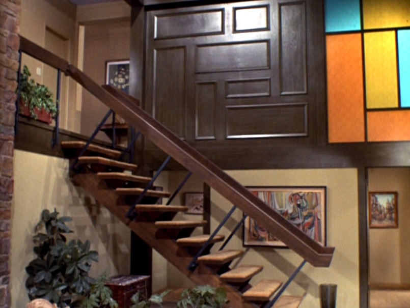
Lengthy online searches for this particular horse sculpt have yielded no results. However, it is styled after countless prancing horse statues from China’s Tang Dynasty. During that period horses were a sign of prosperity and a major component of the military. This isn’t the only horse in the Brady home, either. A painting of a stylized steed is seen at the top of the stairs during all but the first season, and a smaller horse statuette is on a table in the family room.

Top: abstract Modern painting; middle right: the painting appearing on “The Mod Squad” (screenshot courtesy of The Brady Bunch Blog); bottom: painting of Place de la Concorde outside Mike’s home office
The abstract Modern painting behind the main staircase is also memorable due to its placement, size, and style. Pixelated screenshots reveal no signature to demystify its origin. We know who designed the Great Pyramids, but the identity of this contemporary master is lost to the ages. Presumably, the piece was a studio prop, given that it appeared on The Mod Squad (1968-1973) a year before The Brady Bunch aired. The painting serves as a Brady fan’s Rorschach test; it’s unclear whether it is entirely non-objective, or represents something of this earth. I’m confident that it’s a riverside city under a rain of orb-like doomsday asteroids. Abstract art has been around since the early 20th century, and it received a jolt in the 1920s when Cubism inspired a frenzy of offshoot -isms such as Futurism, Vorticism, Neoplasticism, and Purism. The United States took a couple of decades to warm up to it, but by the 1950s mass market art sellers jumped on the imitable trend and produced a soup of abstract compositions like the one in question.
At the end of the hall leading to Mike’s home office is a piece depicting the Place de la Concorde, the largest public square in Paris, painted by Marcel Masson under the pseudonym Antoine Blanchard. From this vantage point we can see the Fountain of River Commerce, and the ancient Luxor Obelisk. It serves as a visual respite where Mike fixes his eyes as he transitions to his home drafting table. It’s a pleasant scene that’s both familiar and foreign. It’s everything that a painting in a hallway should be.

Top: Painting of ruins left of living room doorway; bottom left: painting of ruins in Mike’s home office; bottom middle: painting of ruins in Mike’s place of employment; bottom right: painting of ruins in the family room
To the left of the front door is a tall rendering of Greco-Roman ruins. This is a Brady motif that may go unnoticed despite appearing throughout the home. A similar companion to this piece is in Mike’s home office, and occasionally the two paintings swap places. (The first print previously appeared on I,Spy in 1968.) Mike can admire ruins throughout the day thanks to a vibrant painting of decaying columns at his workplace. Back at home there’s a small illustration of a weathered colonnade in the family den that rarely makes it on camera. The latter pieces have all the earmarks of Vanguard Studios, a company that mass produced wide format “drip paintings” on luminous backdrops.
Pictures of Classical architecture may seem like a nod to Mike’s career, but the choice follows the mid-century passion for decorating with time-ravaged monuments. The artistic fascination with ruins goes back a few hundred years. Giovanni Battista Piranesi (1720-1778) was known for the subject matter. A slightly more contemporary example would be Caspar David Friedrich’s work, including Temple of Juno in Agrigento, circa 1828-30. Ruins are great because they allow moderns to admire ancient ingenuity while still feeling superior to the failed civilizations.

Above: duck paintings in season one family room; inlay: starburst clock in season one family room
The Family Room
During the first season, the family room walls are dominated by imposing scenes of duck-filled marshlands, one of them featured in the hotel in the pilot episode, which seems to suggest that the Bradys stole it. For decades, these “hunter’s delights” were omnipresent on walls across America.

Left: art arrangement in family room; right: two illustrations by Gerda Christoffersen
It wasn’t long before the set dressers replaced the ducks with an eclectic arrangement of art that looks fresh from a flea market. However, the mismatched styles and themes get a pass since they give the wood paneled den an appropriately casual vibe. The centerpiece is a portrait of a young Native American girl. It’s one of two seemingly identical pieces. Its match is usually on the rarely-seen adjacent wall. (The tendency to break up sets of art is repeated throughout the house.) This is the work of Gerda Christoffersen, a Danish-born artist who produced a multitude of prints that usually feature Native American kids. The illustration foreshadows “The Brady Braves” episode in which the family is adopted into an Arizonian tribe after Bobby and Cindy fed a lost boy beans from the battery compartment of a flashlight.

Top left: “Old Boat Works” gold etching by Lionel Barrymore; top right: “Home Port” gold etching by Lionel Barrymore; middle: Barrymore’s gold etchings on wall in the family room; bottom left: packaging for Lionel Barrymore prints; bottom right: “Water Front” gold etching by Lionel Barrymore
Flanking the papoose are two gold foil etchings by artist and actor Lionel Barrymore, who is brother to John, uncle to Drew, and best known for his role as Mr. Potter in It’s a Wonderful Life (1946). Originally etched on copper in the 1940s, this series was, according to a description that came with the product, “accidentally discovered…by a long-time friend and associate.” Soon his work was “brilliantly enhanced by the luster of gold foil” and sold posthumously. Colorized versions were also made available, just like It’s a Wonderful Life. This is truly art for the masses. Numerous editions were released in the 1960s and ’70s by Brown & Bigelow, an outfit that offered promotional advertising premiums in the form of ashtrays, pasta strainers, and risqué letter openers. The company also produced a deluge of ready-to-frame prints with subject matter ranging from Cassius Coolidge’s poker playing dogs to etched foil likenesses of their holinesses, Pope John Paul I and II. The online auction market is flooded with Barrymore’s portfolios, many of them marked as corporate gifts. One says, “Presented with the good wishes of the Hoefer Funeral Home of Higginsville, MO.”

Top left: painting of the Arc de Triomphe in the family room; top right: painting of the Moulin Rouge in the family room; bottom: examples of Parisian street paintings done in a similar style
Below the etchings are a pair of painted Parisian street scenes. This is third on our list of prominent Brady art themes, after horses and ancient ruins. The colorful piece on the left features the Arc de Triomphe, and the one on the right is the Moulin Rouge. These landmark views have been portrayed by countless artists, especially those catering to the tourist market. The technique, down to the figures that walk the rain-soaked streets, looks to be a learned skill that can be quickly reproduced on demand. It’s the equivalent of the current day spray paint art that’s created on-site in tourist meccas from Fisherman’s Wharf to Times Square.

Left: fishing boat painting in the family room; right: mixed media art in the family room
One element that survived the entire duration of the show is the set of mixed media pieces covered with things you might find in a pair of pants: keys, coins, and a pocket watch, all embedded in a clay-like substance. This has all the makings of a huge ‘70s fad that never was. Near the kitchen entrance is a painting of a commercial fishing boat that replaced a season one starburst clock, which was at the time approaching passé. The artist is a mystery. The heavy-handed strokes and blocky structure give it a post-impressionistic feel. Perhaps it subliminally influenced the Brady’s purchase and restoration of a sailboat in the episode “Law and Disorder.”

Above: cityscape painting above Mike’s home drafting table
The Home Office
The art in Mike’s office away from the office fluctuated as the seasons progressed. Either he’s very particular, or Alice has too much free time. It would appear that Mike likes to inspire himself with the work of other architects. Directly in front of his drawing board is an impressionistic skyline of a contemporary American city. Perhaps it’s a hint that he dreams of working on a larger scale, or maybe it’s a reminder of the urban nightmare he strives to avoid. The most plausible theory is that the art was quickly grabbed from a pile of studio props.

Top: abstract painting above the loveseat in Mike’s home office, season one; bottom: painting of ruins above the loveseat in Mike’s office, season two
Early in the series a horizontal abstraction—Edge of a Wood (1950) by English painter Ivon Hitchens (1893-1979)—hung over the loveseat. The autumnal view was soon replaced with another dose of ancient architecture. The painting’s free-form brush strokes are like a slap to the face of old world precision.

Top: Mike’s home office, season three; middle: Mike’s home office, season two; bottom: Mike’s home office, season one
The wall space in the office vestibule suffered three different paintings in five years. This had a disorienting effect on the kids and may explain why Greg once abducted a goat. The first piece was a standard beach scene. It was quickly replaced by another French street with loose brushwork called Byways by Paul Romier. Online searches for the name yield almost no information; however, quite a few Romier originals are out there, which indicates that they were produced in volume. Incidentally, a cropped version of this print makes an appearance on a motel wall in The Terminator (1984).

Top: “Byways” by Paul Romier in Mike’s office and in reality; middle left: Parisian street painting by Edouard Cortès in Mike’s home office; middle right and bottom: similar examples of Edouard Cortès’ street scenes
Byways was eventually banished to the hallway outside Carol and Mike’s bedroom in favor of a painting of a rainy day in Paris that stayed put until series’ end. It’s the handiwork of Edouard Cortès, a post-impressionist known for his many depictions of French streets near famous landmarks. In this case it’s the Boulevard de la Madeleine. Cortès’ street compositions often follow a strict formula that includes the same horse-drawn carriages, morris columns, and cameos of his own wife and daughter. At the same time he explored a wide variety of atmospheric and lighting conditions. This somewhat scientific approach is a defining trait of Impressionism, and the painting is more evidence of the Brady’s silent obsession with Paris. It’s a sad testament to a failed dream, considering the closest they ever got was Hawaii.

Above: variety of art in the girls’ room throughout the seasons
The Girls’ Bedroom
The girls are the biggest art consumers of the family, and their artwork moves around the room in a constant orbit. Small pieces that are too numerous and too mysterious to mention appear and disappear. When the room was re-wallpapered in season five, it received a complete art transfusion.

Top: blacklight posters in the girls’ room; bottom left: “Butterfly of Love” blacklight poster; bottom right: a variation of “Electric Cat” blacklight poster by Joe Roberts Jr.
Some of the show’s most memorable graphic art is on display on the wall behind Marcia’s and Jan’s beds. The “Butterfly of Love,” the “Electric Cat,” and the lesser seen cartoon Sun, are all off-the-rack blacklight posters. These images must have been among the most savory in the head shop, metaphors for the Brady’s tame yet hip status. The cat was first to appear. It’s dated 1967, and signed by Joe Roberts Jr., who also translated Alice in Wonderland, Jimi Hendrix, and Timothy Leary into silk-screened poster illustrations. Some of us are still furious that Jan’s Yogi Bear poster from King’s Island never made it onto the wall.

Above: mixed media hippo in the girls’ room
I feel obligated to mention the crafted hippo near the bathroom door. It appears to be outlined with fabric cord, and has button nostrils and gemstone embellishments. There’s a matching critter, possibly a cat, on the opposite side of the doorway that’s very difficult to spot.

Top: a rare shot that reveals both clown prints by Bardot in the boys’ bedroom; middle: complete set of four clown prints by Bardot; bottom: progression of wall arrangements, seasons one through four
The Boys’ Bedroom
The Impressionism-influenced clown by the door is hard to miss. Still, it’s easily mistaken for a hobo in a blood-stained shirt. It was there from the beginning, and early on it had the wall to itself. The clown briefly traded places with a group of baseball photos, but ended up surrounded by them for the remainder of the series. It’s easy to imagine a lost episode where Greg and Bobby lock horns over the wall space before arriving at this compromise. Another, sadder clown can be seen over Greg’s bed in a couple of episodes. In fact, they come from a set of four prints, all signed “Bardot.” My gut tells me that this is another corporate appellation; the internet doesn’t prove otherwise, but I can’t be sure. The set was a mail-order promotion that ran in 1965 in The Saturday Evening Post. It sold for one dollar, plus ten cents postage. The business that supplied them was called Great Art Treasures, a New York City company that also offered a similar collection of Keane-inspired “Big-Eyed Moppet” prints the same year.
In typical mail-order fashion, there was a catch. The prints, which were delivered in what resembled an empty toilet paper tube, arrived with a flyer that states, “The lovely Bardot Clown prints which you have just received are 6” by 15”. This is not a standard frame size and normally would require expensive custom framing. However, TO SAVE YOU TIME and MONEY, we have purchased a large quantity of specially-made, beautiful frames to fit these 6” by 15” art prints.” Those “Hand-Rubbed ‘Antique Gold’” beauties would set you back an additional $3.98.

Above: posters above Greg’s bed
The space over Greg’s bed was updated at least twice with art that’s more teen-appropriate: a psychedelic Sun poster that could be the inspiration for the song “Sunshine Day,” followed by a photographic surfer poster that proves that Greg’s love for the sport wasn’t dampened by his near-death accident caused by a Tiki curse.

Top: two nautical paintings above Peter’s bed; bottom: three pop-inspired paintings in the boys’ bedroom
Two nautical scenes can always be found above Peter’s bed. There are at least seven maritime works in the house, enough to qualify as another full-blown artistic theme. They fit the room’s red, white, and blue color scheme while matching the wallpaper’s pattern of ships and world maps (later updated to Victorian-style print advertisements).
The paintings were no stranger to the habits of television brothers: they also hung on a bedroom wall in Paramount’s My Three Sons (1960-1965). These views of the sea provided Peter with a refuge during adolescent trials like his defeat at the hands of Buddy Hinton, his forced stint as a Sunflower Girl, and the “pork chops and apple sauce” identity crisis.
In the second season, three loosely-brushed, collage-like paintings showed up in unlikely places between the existing decorations. The energetic patchwork style and inclusion of text is somewhat Jasper Johns-esque. The paintings support the show’s stylistic progression towards a more vibrant, Mod look, and hint at Greg’s famous psychedelic overhaul of Mike’s home office.

Top: End of an Arabesque by Edgar Degas in the parents’ bedroom; bottom left: ballerina drawing in parents’ bedroom; bottom right: glass blown ship in parents’ bedroom
The Parents’ Bedroom
The couple’s haven has limited wall space due to the large, leaf-covered screen above their bed. The spot by the door is adorned with one of Edgar Degas‘ many ballerinas. End of an Arabesque (1877) was a second season replacement for a charcoal drawing of another ballet dancer. On the opposite side of the doorway is a small shadow box containing what appears to be a blown glass ship. Again the art offers no insight towards what makes mom and dad tick. More telling is the time they let Cindy’s sniffles ruin their dinner date, and the fact that they brought their kids on their honeymoon.

Above: a sample of the art appearing in the upstairs hallway
The Upstairs Hallway
The stretch of hall that connects all the bedrooms is a monument to inconsistency. It’s as if the cast and crew held art throwing contests between takes and whatever happened to be stuck on the walls ended up in the next scene. It’s also a graveyard for art that’s been ousted from the rest of the house. Generic florals, landscapes, and street scenes are common. One exception is a short-lived print of William Harnett’s The Old Violin from 1886.
Conclusion
Horses, ruins, boats, Paris—what does it mean? The lack of meaning is the point. It’s stock art for a show with stock characters that include Sam the butcher, Tiger the dog, and Oliver the misfit. If one of the artists were ever portrayed on screen, he would likely wear a beret and goatee, and speak condescendingly in a wacky accent. While there’s plenty of provocative art in the world, the Brady collection does a great job of quietly existing on the walls, ensuring that the Bradys are always the most interesting thing on the screen.
This article has been revised on March 12, 2017, to reflect the following corrections: the painting Edge of a Wood (1950) was identified by commenter BananaForce, and the artist who painted Place de la Concorde, Marcel Masson, was identified by commenter Jim Van Verth.
Kirk Demarais![]() is a freelance creator and the author of Mail-Order Mysteries: Real Stuff from Old Comic Book Ads and Life of the Party, a visual history of the S.S. Adams prank and magic company. He also teaches the history of art, advertising, and design at John Brown University.
is a freelance creator and the author of Mail-Order Mysteries: Real Stuff from Old Comic Book Ads and Life of the Party, a visual history of the S.S. Adams prank and magic company. He also teaches the history of art, advertising, and design at John Brown University.


Thanks for the tip! I didn’t know that.
I believe the “Boulevard de la Madeleine” is by one of Edouard Cortès’ contemporaries, Antoine Blanchard. My mom bought a print in Los Angeles in the early 70s. When I saw it in an episode as a teenager, I lost my mind. It’s hanging in my work office.