Exhibit / January 9, 2020
-
- Cover page of NASA Graphics Standards Manual; the new standards took effect on January 1, 1976.
-

- Introductory letter from NASA Administrator Richard Truly; he would become head of the agency in 1989 and was responsible for the famous “Pale Blue Dot” photo.
-
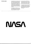
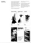
- The “worm” logotype for NASA, embodying “unity, precision, and thrust.”
-
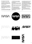
- Here a page of NASA logotype “don’ts”; all efforts to dilute or distract from the simplicity of the “worm” were strictly prohibited.
-

- Exceptions to the new NASA branding were made for NASA mission patches, an important part of astronaut morale.
-
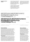
- Helvetica was a trendy corporate typeface in the 1970s, but also made appearances in public agencies like NASA and the National Park Service. Futura, Times Roman, and Garamond were also allowed as text typefaces in NASA’s Standards Manual.
-
- One of many pages featuring covers for NASA publications; here, informational pamphlets showcase a modern, crisp design aesthetic and that omnipresent Helvetica.
-
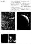
- “Quality publications” by NASA would not only feature the new logotype and Helvetica, but should be attractively printed using four-color printing techniques.
-
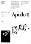
- Educational publications could be a bit more free-wheeling, eschewing “pretentious frills.”
-
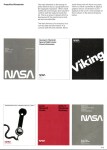
- Again, a sleek and minimalist aesthetic dominates on NASA reference materials: internal directories and press kits.
-
- The “Aerospace Education Unit” was one of many land vehicles featured in the NASA Manual; its mission of outreach was accentuated by the eye-catching “NASA Red.”
-
- The Space Shuttle Discovery was in its early design phases in 1975, but this glimpse of the now-familiar Helvetica-embossed fuselage would become an everyday sight in the 1980s.
Object Name: The NASA Graphics Standards Manual
Maker and Year: Danne & Blackburn, 1975 (official publication date January 1, 1976)
Object Type: Graphics standards manual
Image Source: NASA
Description (Michael Grasso):
In the mid-1970s, the National Aeronautics and Space Administration was in a period of transition. The final manned Apollo mission to the Moon, Apollo 17, had returned to Earth in December 1972; no further Moon landings were planned. NASA had recently kicked off their Skylab experiments in short-term orbital space station living (and détente-inspired collaboration with the Soviets), as well as announcing a reusable fleet of Space Shuttles, and were simultaneously planning a series of unmanned probes to the other planets of the solar system in the latter half of the ’70s. In this era of NASA’s shift from moonshot-style Cold War political statement missions to a more sustainable and diverse set of mission profiles, the organization underwent a massive rebranding, one driven in part by an overarching federal initiative to bring federal agencies into the 1970s by standardizing their graphic and visual design.
The Federal Design Improvement Program (FDIP) was an outgrowth of the Nixon-era National Endowment for the Arts (NEA), impelled by a 1971 Nixon directive for federal agencies to “direct your attention to two questions: first, how, as a part of its various programs, your agency can most vigorously assist the arts and artists; second, and perhaps more important, how the arts and artists can be of help to your agency and to its programs.” The wildfire growth of American public television in the early 1970s, as well as programs like the Environmental Protection Agency’s DOCUMERICA, showed that these statements of federal backing for the arts and humanities were not merely empty gestures on the part of the Nixon Administration. The NEA’s chief at the time, Nancy Hanks, initiated the FDIP, which not only included a graphic design-oriented Federal Graphics Improvement program but also programs using art to beautify federal buildings as well as upgrading government buildings through a Federal Architecture Project. NASA was not the only federal agency to take up the FDIP’s offer of redesign. The U.S. Postal Service also set out its own program for modernizing the design of stamps, Post Office signage, and branding; the Department of Transportation’s “Symbol Signs,” developed in 1974 by the American Institute of Graphic Arts, became international standard; and the National Park Service hired famed New York City subway designer Massimo Vignelli to initiate a “Unigrid” set of standards for park and museum signage design that is still used to this day.
The 1976 NASA Graphics Standards Manual was the product of New York design firm Danne & Blackburn. Richard Danne was a longtime commercial designer for the film industry who designed the iconic poster for 1968’s Rosemary’s Baby; Bruce Blackburn’s background was in corporate branding and in 1971 he had won one of the first FDIP-related government contracts for the official logo for the American Bicentennial. Danne and Blackburn’s effort to modernize NASA’s visual design put them up against a conservative agency still very much attached to a militaristic design aesthetic (influenced in part by the sleek rocketships on the covers of midcentury science fiction novels) throughout the Mercury-Gemini-Apollo era. Danne and Blackburn’s futuristic “worm” NASA logo, their use of Helvetica throughout (a favorite of European designers like Vignelli), and their preference for sleek, spare standardization conveyed “a feeling of unity, technological precision, thrust and orientation toward the future,” in the words of NASA Administrator Richard Truly in the Manual foreword. Indulgences were allowed for the older, more bespoke design style of the Space Race-era agency. Mission patches, often designed in part by the participating astronauts themselves, were yet another legacy of astronauts’ backgrounds in U.S. Cold War military service, and were preserved by the Standards Manual: “They should occupy their own visual space, separated from official NASA identification. In this way, the two elements are noncompetitive and the mission patch can achieve the emphasis it deserves.” The old NASA “meatball” logo was also reserved for “award presentations or formal events and activities which are ceremonial or traditional in nature.” The modernizing impulse of Danne and Blackburn recognized that in NASA’s culture, the pull of military tradition was still very strong. The Manual provides some interesting insights into NASA missions of the late ’70s and beyond, with the Space Shuttle Discovery making a prominent appearance to show off what the new NASA visual design would look like on a real spacecraft, as well as schematics demonstrating the new NASA branding on earthbound vehicles and on crew uniforms. Ultimately the NASA Graphics Standards Manual does reflect a profound institutional change. The quasi-military Space Race glories of the 1960s are to be respected but enshrined, segregated, put behind glass. A new NASA—one arguably consisting of more scientists than cowboys—took the agency into the futuristic era in the 1980s.
In 2017, a Kickstarter initiated by the publishing house Standards Manual (founded by designers Jesse Reed and Hamish Smyth) funded a re-publication of the Danne and Blackburn NASA Standards Manual that included bonus material from Danne and supporting documents from the design proposal process. Reed and Smyth had previously brought out a modern coffee-table version of the New York City Transit Authority Graphics Standards Manual, and recently have published versions of the 1970s EPA Graphic Standards System as well as a retrospective catalogue of the work of midcentury design firm Chermayeff & Geismar (where Blackburn had worked in the 1960s), responsible for the iconic modern NBC Peacock, the PBS “P-Head” logo, and Pan-Am’s corporate logo, among many other familiar pieces of Cold War-era corporate identity.


Pingback: História dos Nossos Tempos: Capturas na Rede, 25 de Janeiro
Pingback: “Become a Good CBer”: Citizens Band Radio Service Rules, 1978