By Richard McKenna / June 12, 2017
 Despite the dispiriting fug of “classic rock” that hangs about their name—largely thanks to the persistence in popular culture of the song for which they are best known, the wonderful but largely unrepresentative “Don’t Fear the Reaper”—Blue Öyster Cult began life as a high-concept countercultural proposition whose aim was to bring an underground literary and musical sensibility, as well as wit, to the dull, self-indulgent ceremonies of rock, parodying and inhabiting in equal measure the genre’s rituals and semiotics while outdoing it in terms of hooks, amps, and stack heels. “We were a parody of the heavy metal beast… sort of an inside joke to ourselves of what heavy metal really is,” the band’s frontman Eric Bloom told British music weekly Sounds in 1978. It was an intention that played as important a role in Blue Öyster Cult’s record covers as it did in their music and lyrics.
All veterans of the psych-rock scene, the initial—and definitive—line-up of Blue Öyster Cult was Bloom on lead vocals and “stun guitar,” Donald “Buck Dharma” Roeser on lead guitar and vocals, Allen Lanier on keyboards and rhythm guitar, and the powerhouse rhythm section of brothers Joe and Albert Bouchard on, respectively, bass and drums, with both providing backing vocals. In addition to the performers, contributors to the band included influential rock critic Richard Meltzer, writer of 1970’s The Aesthetics of Rock, one of the first serious works of rock music criticism (he was later part of punk group VOM with “Metal Mike” Saunders, the man credited with the first use of the phrase “Heavy Metal” in reference to music), and Sandy Pearlman, a polymath rock critic and songwriter who also managed proto-punks The Dictators and produced the Clash’s second LP, Give ’Em Enough Rope (1978). The principal brain behind the band’s initial aesthetic, Pearlman claimed that Blue Öyster Cult’s literary influences were “Rimbaud, Dada, H.P. Lovecraft and yer standard assortment of doomo writers i.e. turn-of-the-century Russian and German.”
Too smart to be actual “heavy metal”—music critic Robert Christgau called them “closet intellectuals” and Meltzer said they were “hard rock comedy”—all seven of them contributed to songwriting, with occasional external input, most notably from Lanier’s ex-partner Patti Smith and British New Wave SF author Michael Moorcock (who had also contributed lyrics and ideas to British spacerock giants Hawkwind).
At the time the band’s first string of albums was released, the principal sources of information for the rock fan were magazines, meaning that most of the audience probably would have been blissfully unaware of the concept behind BÖC’s lyrics: developed by the undergraduate Pearlman, this was an alluringly hokey blend of his interest in history, warfare, SF, Lovecraftiana, the paranormal, the occult, and conspiracy theory. To be honest, what the rock fans didn’t know probably worked to the band’s benefit, as the lyrical narrative proved much more evocative as vague revelations than as the rather tiresome “mythos” which later emerged, and which grew increasingly less interesting as the band entered its dotage.
With their allusions to high strangeness of all types, Blue Öyster Cult’s album covers performed the same function as their content and—whether by accident, design, or coincidence—featured several of the artists who contributed to defining the pop aesthetic of the day, the influence of which continues to loom over our own times.
Blue Öyster Cult (1972) and Tyranny and Mutation (1973)
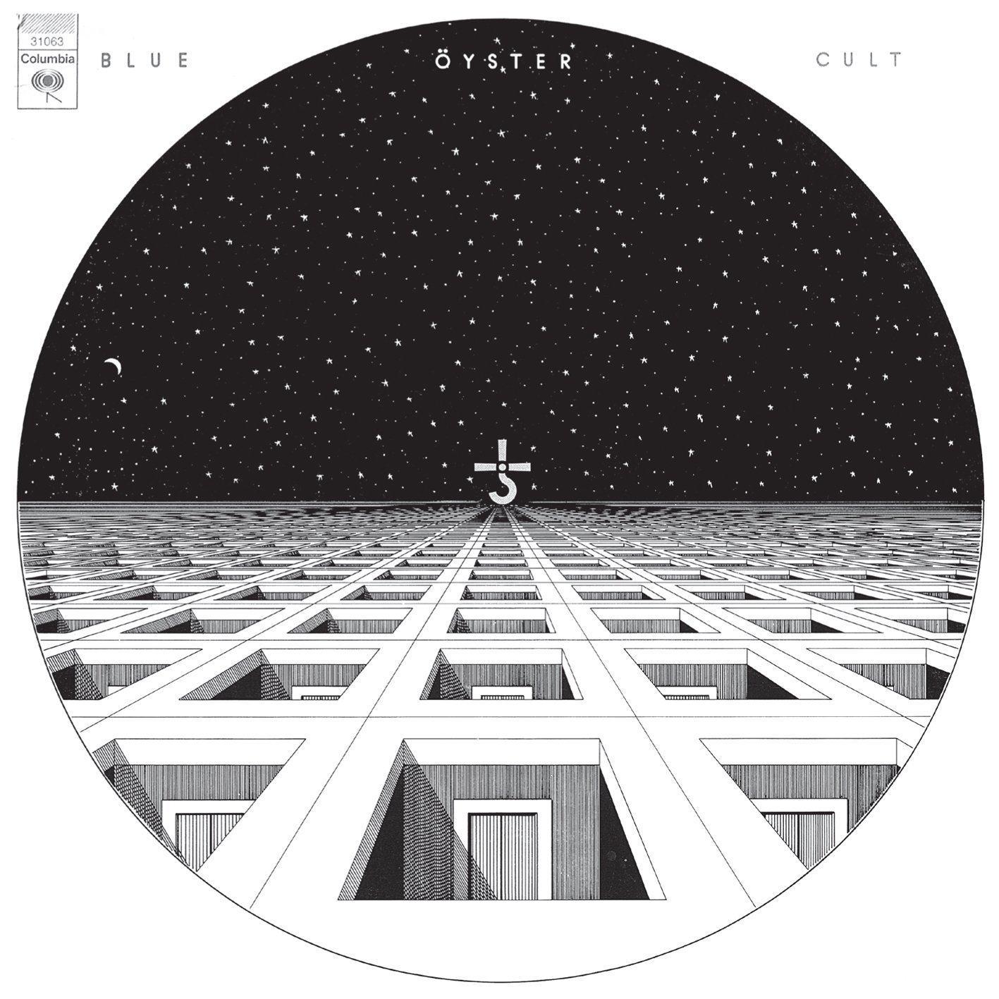
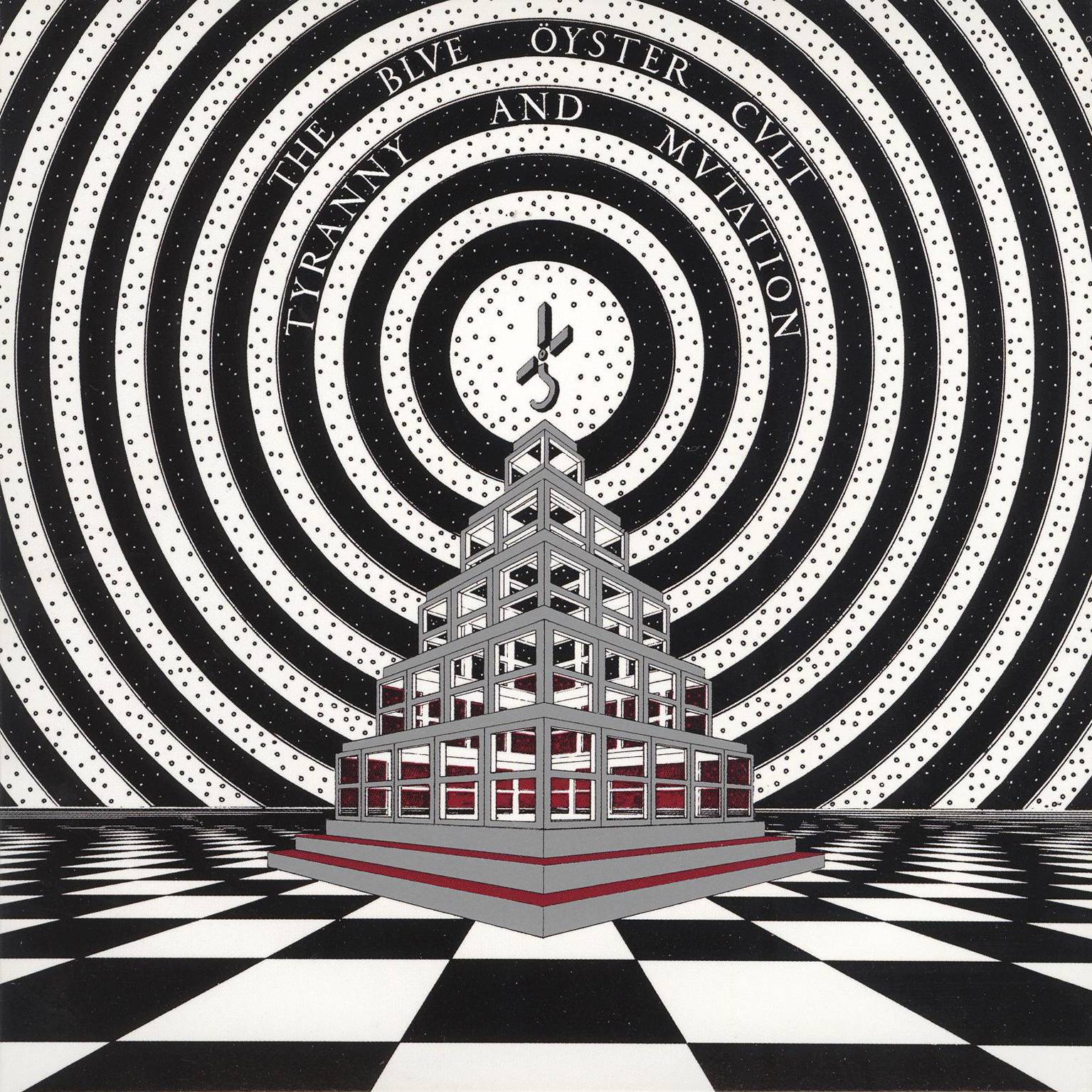
The memorable artwork featured on the covers of the first two Blue Öyster Cult releases was the work of Bill Gawlik. By all accounts a singular personality about whom little is known, Gawlick, who made ends meet by working nights as a taxi driver in New York City, had apparently been a student at the Rhode Island School Of Design (in the historic district of Providence, Rhode Island, just around the corner from H.P. Lovecraft’s former home on Angell Street) and the Parsons School of Design in Greenwich Village, and had also studied under architect, urban planner, and furniture designer William Katavolos (famous for his steel tubing and leather T-Chair) at the Pratt Institute in Brooklyn before transferring to Stony Brook University, where he met fellow students Pearlman and Meltzer. Gawlick was engaged after Pearlman saw the architectural drawings in which Gawlick detailed his vision of the future of America using a Pelikan pen on rolls of butcher paper, and was reportedly paid $500 for each cover.
Anecdotal contemporary accounts mention Gawlick’s influences including Albert Speer, the architect Hitler had charged with designing the urban landscape of the future Europe (and a proponent of “ruin value,” the idea that buildings should be designed so as to leave behind aesthetically pleasing, inspiring ruins when they inevitably collapsed), but Gawlick’s style—or at least what we can see of it on these two LP covers—appears to have less in common with Speer’s metastasizing classical triumphalism and more with the work of Futurist architects like Mario Chiattone and Antonio Sant’Elia, or with the draftsmanship of underground comics illustrator Paul Kirchner.
In addition to providing the band with the title of their second LP, Tyranny And Mutation, Gawlick was also responsible for devising Blue Öyster Cult’s memorable logo—a hooked cross with a dot at the center, allegedly based on the symbol of Greek agricultural god and “harvester” of human life Cronos. A direct ancestor of the Grim Reaper, Cronos was known in Roman cosmology as Saturn, and the symbol’s hook represents the sickle he used to castrate and depose Uranus, his father.
The two covers’ profoundly eerie metaphorical spaces, devoid of any trace of humanity and nodding to the lysergic perspectives and repetitions of underground comic art, yet executed with a peculiarly alienating rigor, provided a perfect framing device for the twitchy, idiosyncratic music within. After his work for BÖC, all public traces of Gawlick vanish entirely.
Secret Treaties (1974)
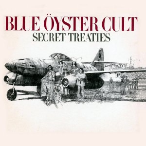
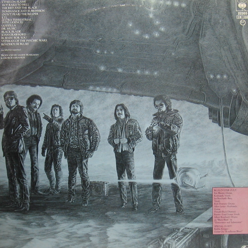
After keeping their identities hidden on their first two LP sleeves, the band was, according to Eric Bloom, “sick and tired of being anonymous [and] wanted people to have some idea of who we were and what we looked like,” so to this end they convinced Pearlman and Columbia to allow them to appear on the cover of their third LP, Secret Treaties, which for many remains Blue Oyster Cult’s greatest achievement. “Secret Treaties was created by the Columbia Records art department,” says Albert Bouchard. “But all in all, Secret Treaties was mostly Sandy’s idea.”
Columbia commissioned artwork from Ron Lesser, a graduate of the New York High School of Music and Art who had studied at the Pratt Institute of Art under Frank J. Reilly, a prolific illustrator who over the course of the ’70s and ’80s turned out vast numbers of paperback covers, many of them for cowboy novels. He also illustrated movie posters, including those for Clint Eastwood’s High Plains Drifter (1973) and Sam Peckinpah’s Pat Garrett and Billy the Kid (1973).
Upon first inspection, Lesser’s black and white artwork appears less striking than the rest of the band’s album covers, the pencil lines evoking the dreamy pulpiness of one of those drugstore Westerns. At once eerie and ludicrous, it depicts the members of the band standing arrayed around a fighter plane with a hooked cross on its tail, parked in what looks like a town square or park. Clad in a seemingly-intentionally absurd cape, Eric Bloom holds the leashes of four German shepherds. The plane’s cockpit is manned by a death’s head, and, in the background, vague silhouettes wearing wide-brimmed hats and resembling Mexican pistoleros look on, though the modern-looking streetlights and scaffolding tower bearing the name “Lopez” seem to imply that we are in the present day. The back cover shows the plane seen from another perspective, its cockpit now empty and the four dogs lying dead on the ground, apparently victims of ritualistic murder.
Two color variations of the image were also produced, one a version of the front cover with what this time appears to be Victorian onlookers and in the distance the dome of what looks like a cathedral. Could it be the Catedral Metropolitana de la Asunción de la Santísima Virgen María a los cielos in Mexico City, and could the setting be that city’s Mestizaje Park? The other picture is a color variant of the back cover, but this time the background seems to be the dusty courtyard of some Latin American church.
The plane is a German Messerschmitt ME 262, the world’s first jet fighter aircraft, introduced into service in the final years of WWII. Bloom denies that there was any political intention behind its use on the cover—it was simply the advanced, potentially history-changing technology it represented that fascinated the band. Pearlman’s habit of littering the band’s lyrics and imagery with references to anything that might evoke mystery or cause a shiver—including the umlaut over the “O” in the band’s name—earned Blue Öyster Cult a reputation as crypto-Nazis in some quarters, though Bloom claims that the fact he, Metzner, Pearlman, and the band’s sometime producer Murray Krugman were all Jewish proves the unlikeliness of the charge. The association of Nazis with the occult became popular, especially among the counterculture, with the 1968 publication of Morning of the Magicians, an English translation of the Le Matin des magiciens, written by French Forteans Louis Pawels Jacques Bergier and originally published in 1960.
The artwork also seems to reference another group with an ambiguously swastika-like symbol: The Process Church of the Final Judgment, otherwise known as the Process Church, an offshoot of Scientology famous for its alleged links to Charles Manson and whose members were known for their black cloaks and predilection for German shepherds—which they were also accused of ritually killing. Given Pearlman’s penchant for throwing together cultish signifiers, it’s not too much of a stretch to believe. Whatever the intent, it’s a beautifully gauged artifact, poised perfectly between the reassuring cheap ’n’ cheerful allure of pop culture and the latent threat of its symbols.
On Your Feet or on Your Knees (1975)

Recorded in New York City, Portland, Seattle, Phoenix, Long Beach, Vancouver, and New Jersey, On Your Feet or on Your Knees was the band’s first live LP, and its cover image—featuring a limo flying BÖC diplomatic flags parked in front of the worrying-looking St. Paul’s Chapel of South Salem—synthesizes perfectly the band’s smelting of the sinister and the ludicrous—the bizarre overlaps of conspiracy, place, and cult. The picture was taken by John Berg, who commissioned covers for albums including Bob Dylan’s Greatest Hits (1967), Fresh (1973) by Sly and the Family Stone, and Bruce Springsteen’s Born to Run (1975). Berg was also responsible for the famous Milton Glaser poster of Dylan, which won him one of his four Grammy Awards.
The brushed-metal gothic blackletter logo, one of the first “Heavy Metal” logo designs, was created by Gerard Huerta, a typographer and graphic designer who did artwork and logos for Boston, Willie Nelson, Ted Nugent, Rick Derringer, Bob Dylan, and AC/DC, as well as posters for Friday the 13th: Part III (1982) and Star Trek III: The Search For Spock (1984). Huerta says of his contribution, “For some reason, I connected the idea of using Bible lettering for this logo, but rendering it with a bevel and in metallic. So, I did this lettering… which kind of became the look of heavy metal. I’ve gone back before that to see if there was anything done like that and haven’t really seen anything. It became the defining heavy metal look.”
The back cover was photographed by Don Hunstein, a staff photographer for Columbia Records who produced some of the company’s most iconic covers, including that of The Freewheelin’ Bob Dylan (1963), while the inside gatefold—a photomontage showing all five members playing guitar to an audience of hooded figures—makes manifest the Cult’s intent to parody rock’s sacred poses.
Agents of Fortune (1976) and Spectres (1977)
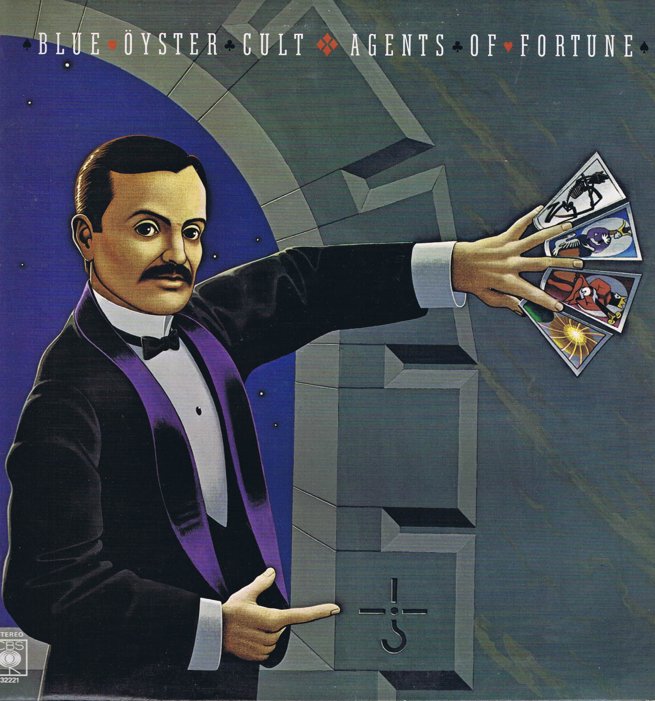
The symbol-rich cover of Agents of Fortune was one of only two album covers painted by artist Lynn Curlee (the other being Black Sabbath’s 1980 Heaven and Hell). Curlee, an art history graduate from the University of North Carolina, had been working as a professional artist since moving to Manhattan in 1971, and the band commissioned the cover after seeing an exhibition of his paintings. For the featured figure, Curlee took inspiration from a turn of the century photograph of a magician, possibly W. D. Leroy, a Boston illusionist and owner of a shop and school of magic that was one of the largest magical apparatus stores of its time. The figure holds in its hands four tarot cards—Death, The Queen, The King, The Sun—from the Thoth Tarot deck painted by Lady Frieda Harris under instructions from Aleister Crowley, a detail apparently requested by the band.
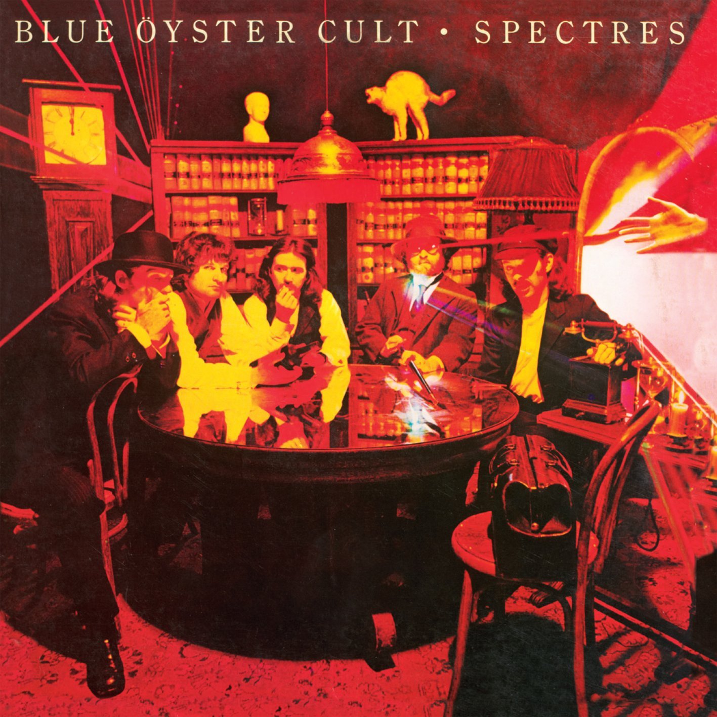
Featuring the band dressed up as what look like Edwardian psychic investigators, the cover of Spectres, BÖC’s fifth studio LP, was designed by artist and photographer Roni Hoffman, whose work on it earned her a gold record. The cover picture was taken by Eric Meola, a self-taught photographer who apprenticed with influential saturation-happy snapper Pete Turner (famous for his string of jazz LP covers throughout the ’60s and ’70s) before opening his own studio in 1971. Apart from a highly successful career as an editorial photographer for publications including Life, Esquire, and Time shooting editorial photos, Meola is also known for his many pictures of Bruce Springsteen, including the iconic black and white shot of Springsteen and Clarence Clemons which features on the cover of the Born to Run (1975) LP. The laser effects, including Eric Bloom’s famed wrist laser, were provided by laser pioneer David Infante of Laser Physics Inc. and used in the band’s laser stage show.
Some Enchanted Evening (1978), Mirrors (1979), and Cultösaurus Erectus (1980)

For the cover of their second live LP, designed by Andrea Klein with a concept provided by Hillary Vermont and Marty Pekar, the band brought in Todd Schorr. Now a well-known figure in the “Lowbrow” or pop surrealist movement, Schorr was at the time a jobbing commercial artist who, since graduating from the Philadelphia College of Art, had been attempting to combine renaissance technique with cartoon subject matters. In the late ’70s, he moved to New York City where he worked on projects including album covers for AC/DC, film posters for George Lucas and Francis Ford Coppola, and covers for Time magazine. He also worked with his friend, illustrator and graphic designer Michael Doret, on an unused logo for the film Alien (1979). The image, rendered more simply than in Schorr’s usual Dalì-esque realism and showing the Grim Reaper riding a horse with a BÖC bridle through a desert landscape, captures perfectly the overlap of self-aware comic-book thrill and existential unease the band incarnated in their prime.
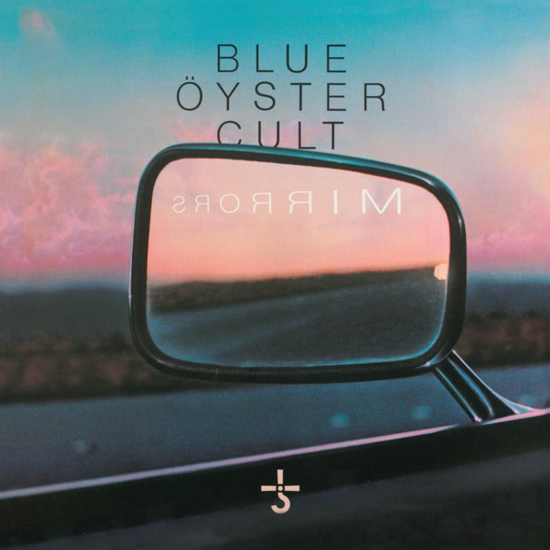
Mirrors possesses one of the least memorable of the band’s LP covers—fittingly, because it’s one of Blue Öyster Cult’s least memorable albums. Despite resembling a photo, the image is actually a hyper-realistic painting by Loren Salazar, a graduate of Central Washington State University. Salazar produced several album covers in the 1970s and another facet of his style can be seen on his cover for Heart’s 1977 LP Magazine.
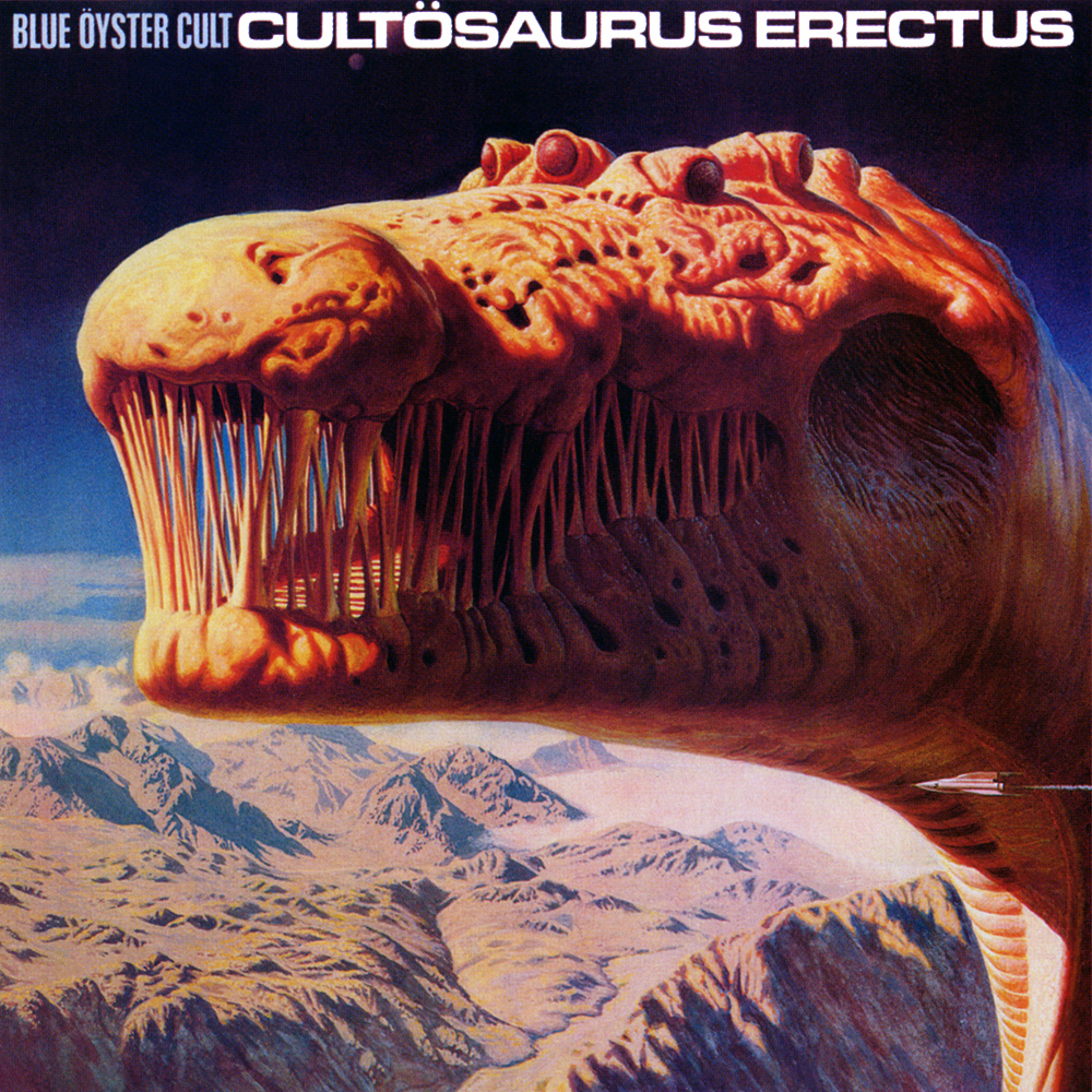
For the cover of Cultösaurus Erectus, whose art director was Paula Scher, the band used a detail from a painting by Brit Richard Clifton-Dey, a prolific commercial artist from Yorkshire who had produced dozens of memorable paperback covers between the ‘60s and ‘80s. The wonderfully evocative Behemoth’s World—the picture’s original title—was used the same year in Paper Tiger’s amazing Tour of the Universe, a lavishly-illustrated coffee table book detailing a fictional journey around the inhabited planets. The art, like the record’s content (which included songs co-written with British New Wave science fiction and fantasy author Michael Moorcock), underlined Cultösaurus Erectus’s emphasis of overtly genre subject matter, from the Elric-inspired “Black Blade” to the Lovecraft-esque “Lips in the Hills.”
Fire of Unknown Origin (1981), Extraterrestrial Live (1982), and The Revölution by Night (1983)
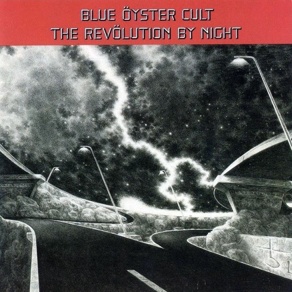
For these three LPs, the band turned to Greg Scott, a painter and illustrator who worked as an art director for Rolling Stone and The New York Times during most of the ‘70s and ‘80s. Scott produced a series of memorable images, which took the accumulated BÖC ephemera and regurgitated it in a form that shows the trippy influence of European comic artists like Mœbius and Bilal popularized by Heavy Metal magazine since 1977.
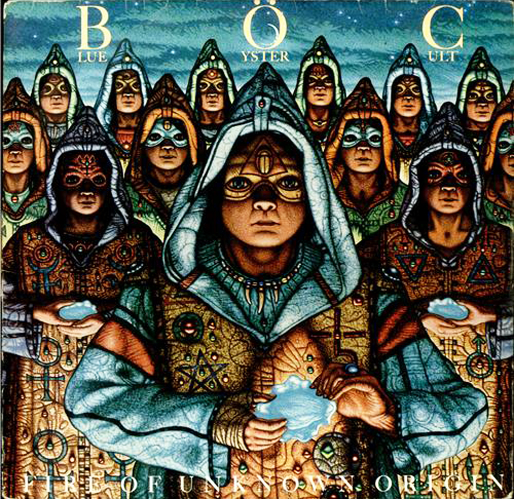
Designed by Paula Scher, Fire of Unknown Origin was the last BÖC studio LP to feature all the original line-up, so it seems apt that it should possess one of the band’s silliest and most compelling covers, featuring a wonderfully literal interpretation of the band’s name.

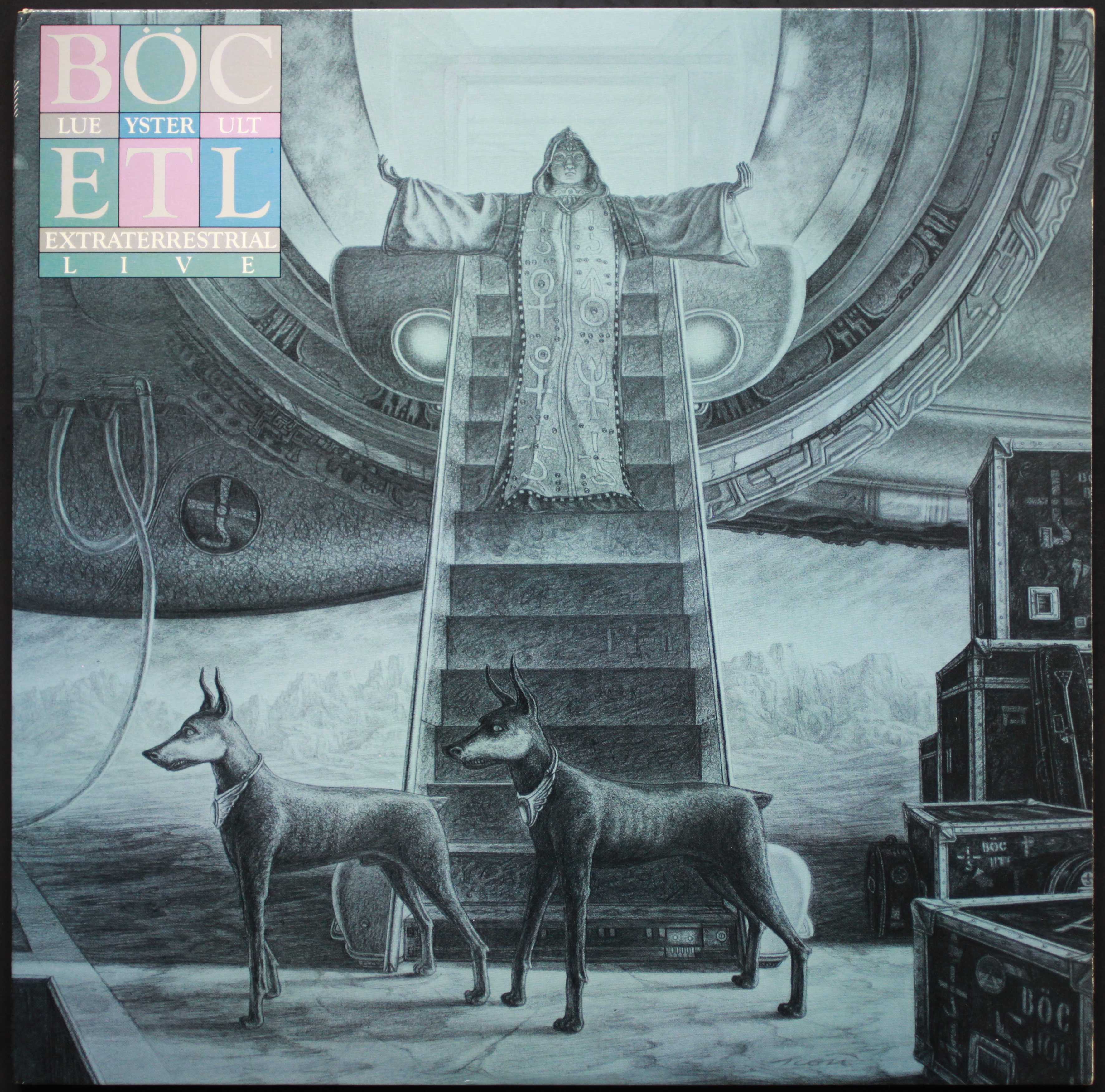
Though dogged by the same muffled sound that afflicts all BÖC live recordings, Extraterrestrial Live also boasted a cover for the ages and is a fitting bookend to the band’s career, with a gatefold that posited the band’s touring setup ferried about by a UFO, as well as an epochal image of a Mœbius-esque astronaut dressed in psychedelic colors.
The last of the three, The Revolution by Night, took its name from Max Ernst’s 1923 painting Pietà or Revolution by Night (which shows the artist cradled in the arms of the father who decried his work), and is also the least successful of Scott’s contributions (appropriately, for what is a pretty feeble record), its alien highway lacking any real mystery or underground chutzpah.
Club Ninja (1985)
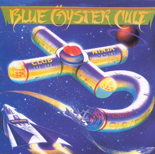

For the cover of the lackluster (some would say atrocious) Club Ninja, the band engaged Don Ivan Punchatz. Despite the execrable typeface, it is as enjoyably pulpy as the record’s contents—especially the BÖC-shuriken-tossing space warrior on the rear—although it contributes little to the group’s mystique and marks the end of them as a consistently creative force. Punchatz (who famously accepted a flat fee for producing the cover art for video game Doom instead of the cut of the profits he’d been offered) was a prolific illustrator, producing work for Esquire, Heavy Metal, Playboy, Time, and National Lampoon (for whom he produced a legendary 1974 cover showing Gerald Ford ramming an ice cream into his forehead), as well as dozens of horror and science-fiction paperback covers for Ace, Dell, Avon, Warner, and the New American Library.
After being granted a scholarship at Burne Hogarth’s Cartoonist and Illustrator School by Hogarth himself, Punchatz worked as a medical illustrator and art director for various companies before opening his own, SketchPad, in 1970. According to post-underground comic artist and illustrator Gary Panter, who was an apprentice there, SketchPad was run like a renaissance workshop, with Punchatz providing the initial sketch, the intermediate steps being carried out by the apprentices, and Punchatz returning to finish off the work. Like Panter, many of SketchPad’s alumni—including Chad Draper, Mike Presley, and Roger Stine—went on to become well-known figures in the illustration and comic worlds. In addition to Club Ninja, Punchatz’s album cover work included Tomita’s 1979 LP The Bermuda Triangle.
“Goin’ Through the Motions”
Against all odds, the band’s next album, 1988’s Imaginos, would actually in some ways be a legitimate—albeit temporary—return to form, despite the band having fallen apart and the record’s best track featuring lead vocals from session vocalist Joe Cerisano. Instead of using the art that Greg Scott had been preparing, CBS decided to use a turn-of-the-century photo of the Cliff House in San Francisco as Imaginos‘s cover, effectively putting an end to the band’s run of mostly inspired covers.
Taken in its entirety, the artwork that featured on Blue Öyster Cult’s album covers over the 13 years between 1972 to 1985 brilliantly evoke a chaotic, colorful world where pulpy esotericism and genuine existential threat—from evil, from conspiracy, from economics, from history—overlap and become indistinguishable: a grand piece of sinister conceptual rock ’n’ roll theater, standing leagues above most of the band’s peers where the imagery, the costumes, the lasers, and the symbols were as much a part of the game as the songs. Blue Öyster Cult’s contribution to the music and the entire aesthetic of genres like post-punk and goth—genres that would reimagine and creatively distort rock archetypes—has yet to be properly acknowledged.
![]() Richard McKenna grew up in the visionary utopia of 1970s South Yorkshire and now ekes out a living among the crumbling ruins of Rome, from whence he dreams of being rescued by the Terran Trade Authority.
Richard McKenna grew up in the visionary utopia of 1970s South Yorkshire and now ekes out a living among the crumbling ruins of Rome, from whence he dreams of being rescued by the Terran Trade Authority.


I’m going to take a stab at a possible meaning for the Revolution by Night album cover.Consider the lyrics to the song Shadow of California”The cloverleaf juncture,a symbol of good luck,emanates darkness”.
Well spotted, Brian – I hadn’t thought of that!
Really great writing about a bunch of great albums…this site consistently rules! B.OC. Rules! Thank you!
Thanks Wolves.
Great writing about a great and mysterious band.
I once got to show Buck and Eric my BOC logo tattoo (my only tattoo, on my shoulder…). Buck said “I’ve seen a lot of those over the years but that’s one of the best”. That made me smile big.
I bet it did! Thanks Brad.
Fascinating analysis, background info and interpretations…thank for sharing the knowledge. Have always loved this band and their album artwork.
Thanks Artie, it’s our pleasure!
As a latecomer to the game they were pretty much done when I discovered them in 1986. I was introduced to them during a “Bacwards Masking, and Satanic Symbolism used in Rock Music” seminar held at the local church. I went, unlike other attendees, to take notes and hear rock music in church. I loved the irony that they were deliberately inviting in the opposition to supposedly show how “bad” it all was. Anyway you can guess the rest. I just wanted to note that once exposed to their music, I fell head over heels for them. The bonus was their name, it contained the word Cult and drove my parents batshit crazy. Thank you for this leaserly trip back through their history. You solidified most of my assumptions about the band. Large and in charge GO GO GODZILLA!
Thanks, Ernest.
Great article. As a a big BOC fan, I have spent many hours watching those covers while listening to the albums. I actually quite like the RBN cover. Not their best album, but I love the sinister feeling of the title track, Feel the thunder and Take me away. And that lonely, scary motorway on the cover brings something to the music…
Thanks Mikael – I agree, it has its own spooky power.
And while you are mesmerized by the sounds focus on the clouds/sky on the cover art …By Night Indeed! DM⚜️
I always loved Blue Oyster Cult Album covers, and of course the contents on the albums. BOC Rocks. Been a fan since 76.
Thanks for this excellent article. With rock bands you can often tell the quality of the music from the artwork and graphics they inspire and choose.
I have come lately to a better appreciation of Mirrors. The cover art is not so great, but several of the songs on that record laid ear-worms that took a couple of decades to hatch. “The Great Sun Jester” in particular, for that one its the lyrics, then the music.
Thanks, Sparks – yes, Mirrors has its charms…
The Vigil is also really great. Live, it’s perfectly breathtaking, easily one of my fav songs.
Yes, The Great Sun Jester the first of 3 song collaborations with famed Fantasy Novelist Michael Moorcock. Other favorites of mine off the Mirrors album are The Vigil and I am the Storm.
I believe the ‘night highway’ cover of Revolution By Night was originally meant to be the back cover, and the Akhenaten image on the rear was supposed to be the front (hence the large areas of space on the highway image, for credits and titles and whatnot) Source: album artist Gregg Scott, talking to Martin Popoff in the latter’s BÖC biography, page 197/198.
I’d also recommend Julian Cope’s Head Heritage piece on the Cult’s earlier albums, “IN YOUR DREAMS OR IN MY HOLE”. Cope is a little hard on their middle years imo, but absolutely nails the intent and the spirit behind the first three albums.
https://www.headheritage.co.uk/unsung/albumofthemonth/blue-oyster-cult-in-your-dreams-or-in-my-hole
Totally, David – Copey’s always got something interesting to say.
Excellent writing; spot-on analysis of the albums; invaluable info on the cover artists. I’ve been a BOC fan since age 15 in 1976. No band could best them live. I always thought that “Don’t Fear the Reaper” was equal parts blessing & curse to them, as thereafter they seemed to chase their tail trying too hard to ‘force’ another hit like that. Everything before “Mirrors” was sheer genius, but starting with mirrors everything thereafter was hit-and-miss. Their fans spoiled on the high quality of ‘Secret Treaties’ & ‘Agents of Fortune’ for example, didn’t accept the mediocre grasping of superficial trends starting abruptly with mirrors. Heartwarming that they’re still out there, on tour forever. From 76 to 78, they were the #1 concert draw in America. A golden age!
Thanks Ray – that means even more coming from someone who knows their stuff.
Bet we’ve been to some of the same shows, Ray.
Have to disagree a little. To this day, my favorite song from them is Burnin’ for You. Also my favorite album. I think that song shows the heaviness of their guitar work, and it has a very smooth sound to it. I’ve heard some call their music pop rock. Pop rock = short for popular. What everyone sounds like and is listening to. There was nothing popular about this band. They covered such a wide territory. From history, astronomy, philosophy, science fiction, death, UFO’s and E.T. What band compares to that? I tell people, just listen to the lyrics. They should’ve had 9-10 big hits, but a lot of DJ’s or station managers didn’t like their music, or because the word cult was in the bands’ name, they were associated with that. Plus, some albums were promoted poorly by the record companies. Later songs like Dancin In The Ruins, Perfect water, and A Spy I the House Of The Night really show what good work they were still doing. And another of my fav’s is Shooting Shark. I think that song is one of their best put together pieces, with the low key smooth sound of keyboards and the haunting guitar playing. I personally think their mellower songs like Don’t turn your back, Light Years of Love, I love The Night, In Thee, are very good. Most bands from their era tried to keep the same sound for every album, or try to put out what they thought people wanted to hear. Can’t accuse B.O.C. of that. They weren’t afraid to wander into strange lands.
Chris, you may “disagree,” but you clearly have different taste than Ray. I’m a fan of the band up to AOF, having pretty much soured on Spectres. I did enjoy SEE when it came out, but even as a kid I knew Mirrors was a lame turn. It’s fine if you dig the later stuff, but to me it’s mostly some warmed over melange of REO/Journey/Styx with a unique, ripping guitar player and self-consciously obtuse/weirdo lyrics that are veering into preciousness and attempts at “meaning.” To me, their initial combination of twisted riffs, dense but not prog structures and arrangements, snarling leads (and great nasal SG tone) with the vague imagery and mystery of the drug induced/inspired lyrics and artwork, were unique in rock, and let’s admit, very “NYC” as rendered by kids from the suburbs, raised on the British Invasion, SF Psych, LA post-Manson Byrds/Doors mystique, who had just enough knowledge of the Velvets, Stooges, and MC5. I agree with Ray, that DFTR tipped the scales and they began chasing that high (sales, esteem, pan-rock popularity) just as Cheap Trick did after Budokan/I Want You to Want Me. Sadly, despite both bands’ getting ground in the wheels of the record biz, BOC hadn’t the songwriting skills (or rhythm chops – let’s get down to brass tacks: the Brothers were no match for Cheap Trick’s full band groove which was tantamount to AC/DC and ZZ Top).
The opinions of many can be attributed to a simple matter of ‘taste’ – but measurements of commercial success and the duration of that success – and the actual technical ability of the musicians (and how well certain ones work together in a long-term band situation ) – is another matter.
Cheap Trick was a fine pop-rock outfit for about a decade – which was a bit shorter than BOC’s run. “The Flame” in the late 80’s – was an unexpected resurgence for Trick – much as 1981’s ‘Fire of Unknown Origin’ album was for BOC – but the Cult’s was the stronger overall record by far – and the power ballad “The Flame” – while a female-pleasing chart topper – is not a classic hard rock FM radio staple like “Burnin’ For You” is.
I saw Trick a few times from the late 70’s to early 80’s – and they did not possess ( IMO ) any ‘full band groove’ nearly in the same league as an AC/DC or a ZZ Top – and they were not a live hard rock powerhouse even in BOC’s league – who on their best nights in the mid 70’s were considered as strong as Deep Purple were in their early 70’s prime.
Trick’s main strength was the strong and fairly unique vocals of Zander – who clearly had a much better voice and more charisma than anyone in BOC. The well above average guitar skills of Nielsen combined with his R&R clown-geek stage persona added a humorously quirky element that otherwise would have made Trick more forgettable. The nerd-accountant behind the drum kit was a novelty to be sure – but his drumming skills, while strong and steady – were average at best. Albert Bouchard was a far more inventive drummer – and far more important to BOC – as he wrote or co-wrote nearly half of BOC’s material over the years – and provided lead vocals on several great tracks. BOC’s worst mistake was not taking him back soon after they fired him in 1981.
And while BOC (and so many other bands ) could only envy the massive success enjoyed by ZZ Top and AC/DC in the 80’s and beyond – the Bouchard Bros. were among the best hard rock rhythm sections of any classic rock band of the 70’s – they were simply underrated and somewhat anonymous – just as the entire BOC band was – even during their prime’ of 1975 – ’78.
I totally agree with what you’re saying here. I have all of BOC’s albums and I welcomed the changes in their music over the years. It just shows how diversified and musically strong a band they are. What band has all 5 members playing guitars during concerts? What band has all 5 members singing lead vocals on several songs? What band has all 5 members writing several songs on their albums? Only one Blue Oyster Cult. This band is so criminally underrated it’s sickening. Oh and by the way add another fantastic softer song to your list Deadline.
Fantastic writing about a very interesting subject…well done and very informative….
Thank you, Kyle!
Great, great article. I happened across it just now and enjoyed it immensely.
Kinda disappointed that I didn’t get to hear your thoughts on Heaven Forbid.
🙂
Thank you, Jason – I should probably give Heaven Forbid another spin, now that you mention it.
Great article. Personally, I’ve always appreciated the cover of Imaginos more than the contents. Not a “real” BOC album, but it’s compelling as a curiosity.
I was searching for something (anything) about Bill Gawlick and came across this excellent bit of work. Thank you for taking the time. Been a fan since ’73. Saw them more times than I can count. They used to do a New Year’s Eve show at the old Academy of Music in NY that was can’t miss for their fans. Agree with Ray Roberts. I kept trying to get my friends interested in the band based on the 1st 4 albums. Even after AOF came out I couldn’t get them to listen to the (imho) better old stuff. As Ray stated, they kept chasing another big hit; never really got my full attention again. They rarely play in the northeast anymore but they still put on a GREAT show. Again, thanks!
The artwork on ‘Unknown Origin’ (adore those shades of blue! and the extraterrestrial witches… lovely ladies!) lead me to search Greg Scott, which brought me to this fantastic read, so I thank you for the last 45 min of enjoyable lecture, 90 min if I count the ‘in your dreams or in my hole” piece, which I also read in its entirety. In the past I’ve owned the ‘on your feet’ on vinyl, which I acquired just for the cover while being employed in a cemetery and I was pleased to learn some details about it. I was introduced to BÖC in my late 20’s with “The great doctrines of Imaginos”, a bedtime story for the children of the damned, as Stephen King put it, is my preferred of all their works. I’m now 38 and have since heard the whole BÖC catalogue, taking a recent appreciation for 1979’s ‘Mirrors’–recorded in Burbank, Calif., next to my hometown, in the year I was born.
Thank you and good evening,
Sam
Fantastic.
It’s Halloween and I’m listening to BOC again, now that all the kids have finished their debaucheries and candy orgies, for the evening. In the old days I saw the band many times. I remember the original L.A.S.A.R. light show, they had. I saw it their best evening (or so they said) , when it worked 100%, it always broke down. 🙂
They had two beams of green light go out and then they started shaking and vibrating. Then each beam broke into segments, vibrating, rocking back and forth like dashes, instead of a solid line. They started coming further apart and turned into a giant Godzilla, in the sky. This was before Godzilla, the song, came out. Or the same week…In Albany, NY .Agents of Fortune was still the latest and Spectres was hotly awaited. I have never seen anything like it. It seemed three dimensional, like a hologram. The Palace Theater. And they hit the mirror ball and sent L.A.S.A.R beams out over the whole crowd. One awaited a burning death.
Being born during the Eisenhower administration, I was just ripe for Secret Treaties, when it arrived. I had heard a few earlier songs, on the radio. From the BOC Album and Tyranny and Mutation, which I went right out and bought, after a week of digesting Secret Treaties. I always considered their greatest. So many mysteries. My favorite band. Since around 1974. They still play Albany, NY. Outdoors at the Plaza. RIP Allen Lanier. Some “newer” songs are great too. Harvest Moon with John Shirley, the sci- fi writer. When The Old Gods Return. And all the Michael Moorcock tunes…Black Blade, The Great Sun Jester and Veterans of The Psychic War. Listen to the inter-dimensional warriors and their tales of Psychic PTSD told in the ruins of….? Tanelorn?
In 1991 or ’92, they invited me into the Palace Theater again for a private taping of some “Live” songs. I don’t know how they found me. But, they did. I almost didn’t walk all the way downtown. I thought it was a trick. They played for hours. There were maybe 30 people in the whole theater. Amazing. People were dancing. I remember a nice first fight near the stage. This did not dampen things at all. Slight break maybe.
I found your site searching for old Blue Oyster Cult album covers. Nice article Richard McKenna. Good work.Here’s hoping they play Albany,NY again next summer and the summer after. When I was 14 I thought it would never end. I thought, one day they might broadcast from the moon, but alas it seems never to be. Blue Oyster Cult forever.
Thanks Jimmy. Jesus Christ, that sounds amazing. Broadcasting from the moon is right: if any band has got the paranormal technology, the aggression and the nous, it’s them.
Please can I have some more background info on this “private taping”? It needs documenting either here:
http://www.hotrails.co.uk/history/1991.htm
or
http://www.hotrails.co.uk/history/1992.htm
But which?
Great fucking article, really dig your writing. Thanks for this.
Pingback: Earth Visitor’s Passport: ‘Tour of the Universe’, 1980
According to Joe Bouchard, Ron Lesser was chosen for the ST cover because Sandy Pearlman saw a movie poster of his that he liked – Joe said he couldn’t recall which one, though… As for the “Mexican” motif, Joe says that he thought it had “something to do with Nazis in Argentina”…
Hey I have an Agents of Fortune album with the iconic cover but the inside of the sleeve is from a Rick Derringer album with a big photo of Rick. Any idea how many of these were sold before the mistake was realized?
Thank you for this lovely overview of BÖC’s recorded and graphic legacy. I have gotten more and more of an appreciation of the band’s uniqueness over the years. My first exposure to their work was hearing DFTR on the radio in the autumn of 1976. I was then 13. I first saw the Cult live at a hair-raising general admission show at the Philadelphia Spectrum in September of 1979 (on a bill with Rainbow), which I was glad to survive unscathed. A similar scenario to the one that took lives in Cincinnati only two months later had occurred. I was in the crush against the stage for Rainbow, then spent BÖC’s headlining set exhausted and sweat-soaked somewhere high in the stands of the arena. It wasn’t the ideal introduction to appreciating the band live. I distinctly remember Buck in white (while the others were dressed in black) and then, of course, Albert with a the Godzilla head. Three decades later I would hear a bootleg of the show and realize that “In Thee” was in the set that night (the song had peaked at #96 on the Billboard charts that very day). It’s a gorgeous tune that, nonetheless, did little at the time to give me a sense of what BÖC’s true identity was. Were they metal, pop, sensitive songwriters, proto-punks, or jokesters extraordinaire? They were so mercurial and hard to peg. By 1981, the bass player in my high school garage band was a huge Cult fan and he got us to learn “Cities On Flame.” We loved playing that slinky riff and its beautifully syncopated back beat. That June, the bass player and I headed to Bond’s Casino for the Soft White Underbelly show. I finally got the chance to see the band up close and it was wonderful. (Little did we know this would be the final NYC show of the classic line-up. It was also widely bootlegged as it had been an FM broadcast.) The show was fantastic. At the end I caught Buck’s pick. I went home with that “space cadet glow.” Shortly thereafter Albert was gone, I started art school in Manhattan, and my tastes shifted, as well. I wouldn’t see the band live again for 34 years. Fast forward to 2015. I find myself diving into BÖC’s entire catalog in earnest, studying them as if having to write a doctoral thesis, listening to the vinyl with headphones. . . and falling headlong in love. The band that I could never really figure out suddenly made more sense than ever. I go see them play on a bill with Robbie Krieger and I am over the moon when I they launch into “Career Of Evil.” But that night they really make the hairs on the back of my neck bristlie when, for the encore, Buck’s haunting “I Love The Night” fills the air. I have since made annual pilgrimages to meet up with Eric, my old bass player from high school, to see the band we still love. I still can’t really peg them. With that many songwriters, singers, and instrumental powerhouses in the same outfit, who can!? But I embrace wholeheartedly their mercurial nature. Few bands can pull out strange, deep album cuts like BÖC can. Thankfully they are actually willing to do it, especially at those shows in small New Hampshire towns where grizzled, old hardcore fans show up. Maybe, just maybe, they’ll even pull out that banished chestnut, “Subhuman.” If not, I even love them for apparently having some deep conviction strong enough to make them adamant about not playing it.
Thanks Tilmanator, glad you liked it! Yes, they’re a strange band and I think you’re right that it’s their mercurial nature that makes them what they are.
Excellent article, acutely insightful and compelling. Any thoughts of expanding to include discussion of some of the original inner sleeves and / or gatefolds not covered (such as the bizarre Cultösaurus inner with the dolls in the museum, or the Agents gatefold with the band gathered around the lunar roulette wheel)? Your examination of the early visual materials accompanying Secret Treaties, On Your Feet, etc. is fascinating—would love to read your thoughts on some of these other LP accouterments. Also, here are a couple of minor editorial suggestions: Spectres is the 5th studio album, and Lanier and Patti Smith were never married. Thanks for a great read!
Hi Greg – thank you for the kind comments. It hadn’t occurred to me to look at the other stuff, but you’re right, it would be interesting. Will definitely have a think. And thanks for the corrections – duly noted and adjusted!
Pingback: Portals and Presences: The Surreal Landscapes of Hipgnosis
R.I.P. Greg Scott, amazing pencil work and creativity.
note: you put Gaelick and Gawlik.