Exhibit / October 17, 2017


Object Name: Screaming for Vengeance, Defenders of the Faith, and Turbo
Maker and Year: Doug Johnson, 1982-1986
Object Type: LP cover illustrations
Description: (Richard McKenna)
Disappointed with his cover art for their 1980 LP Point of Entry, British heavy metal band Judas Priest decided to part ways with the Polish designer and artist Rosław Szaybo. Szaybo, who had previously created artwork for bands as diverse as Soft Machine and The Clash, had supplied the group with a triptych of memorable album covers whose imagery, particularly that of British Steel, had helped consolidate Priest’s image and, to some extent, define the developing concept of heavy metal itself in the popular imagination. In the wider culture, an aesthetic paradigm shift was underway at the time, as the free market philosophies promoted by the governments in metal’s twin homelands—the US and the UK—began unhitching reality from aspiration: hedonistic juvenile fantasies of power crept in to unseat the gloom, grit, and anarchy of punk and heavy metal, and the surrealism- and psychedelia-influenced imagery of previous eras began to be mined once again for its dreamlike power.
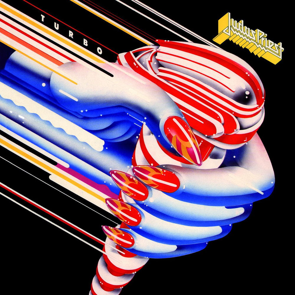
The covers for Priest’s next three records would be provided by idiosyncratic Canadian graphic artist Doug Johnson. A native of Toronto, Johnson had begun in fashion illustration before moving to New York in the late ’60s, where he shared a studio with Charles White III, one of the Californian airbrush artists whose work—a slick amalgam of ’50s chrome and overblown, cartoonish forms—would become synonymous with the visual identity of the times. The success of Johnson’s poster for the Society of Illustrators and a series of football orientated images for Sports Illustrated allowed him to consolidate a personal aesthetic that he cultivated in the following years in jobs including the 1972 Brooklyn Yellow Pages, the poster for the 1974 production of Leonard Bernstein’s Candide at the Broadway Theatre, and, at the end of the decade, the artwork for Space Dust, later known as Cosmic Candy.
Johnson’s glistening, psychedelic surfaces and compositions—which echoed Terry Gilliam’s work for Monty Python—acquired new currency in this era of luminous, abstract veneers, and he reigned in his more rococo tendencies to produce three instantly unforgettable LP covers, all of which bespoke speed and power while remaining oddly non-aggressive, despite the subject matter of the music.
The imagery represented a marked shift from the threatening nocturnal mood, razor blades, smashed glass, and trepanned heads of Szaybo’s Priest covers. Johnson adopted a rousing fusion of some of the previous century’s most striking visual art—sleek, futurist Deco geometries, bold pop art sheen, and wonky underground strangeness, the whole infused with the dreamlike timelessness of art naïf—for the covers of Screaming for Vengeance (1982), Defenders of the Faith (1984), and Turbo (1986). The combination proved to be a surprisingly good fit for the Judas Priest of the 1980s, as did Johnson’s reimagining of the band’s jagged logo (originally designed by Szaybo), now rendered in a blocky, isometric 3D that evoked the playful realities of video games like Zaxxon, released the same year as Screaming for Vengeance.
The Priest covers were to be among the last straight commercial illustration work Johnson undertook. Soon afterwards, he decided to devote himself full time to the world of theater—with which he had been involved since his poster for Candide—and he became a partner of the Dodger Theatrics company, where he produced shows and provided artwork and set designs.


Pingback: Nirvana on Display: ‘Warp’ by New Musik, 1982
Pingback: Between Authority and Resistance: The Terminator’s New Clothes
Fine visual artwork from both: Szaybo and Johnson. Differently but awesome. I like it. Sadly, Judas Priest choose after these works from these graphic artist only silly Heavy-Metal-Airbrush-Monster-Kitsch since today (yes — even “Firepower”).
I couldn’t agree more. I can’t understand how a band that single-handedly defined the look of heavy metal can, at the same time, dismiss the distinct look of their logo and their albums.
Pingback: KitschGlitch | Eokai
Pingback: Defenders of the Faith - Metal Hall of Fame
Pingback: Judas Priest - JazzRockSoul.com