Exhibit / November 20, 2019
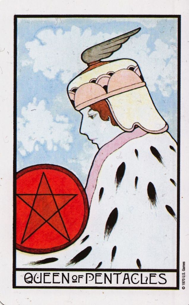
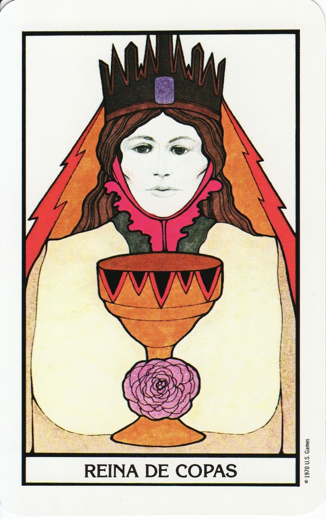
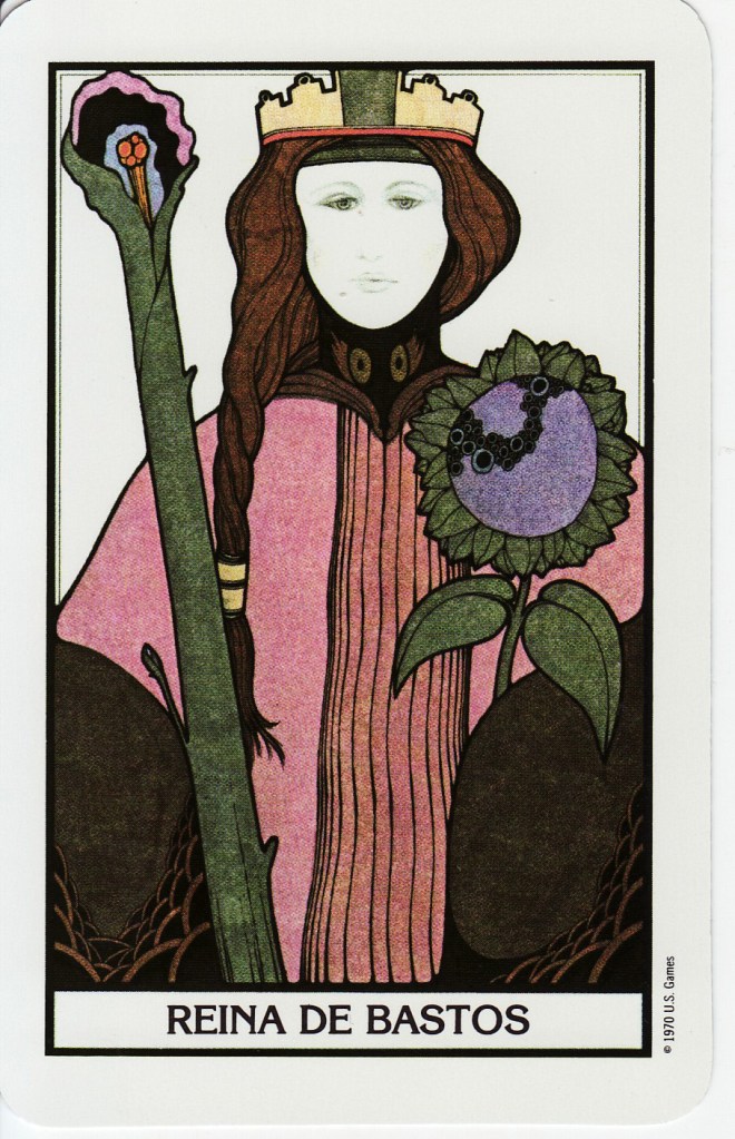
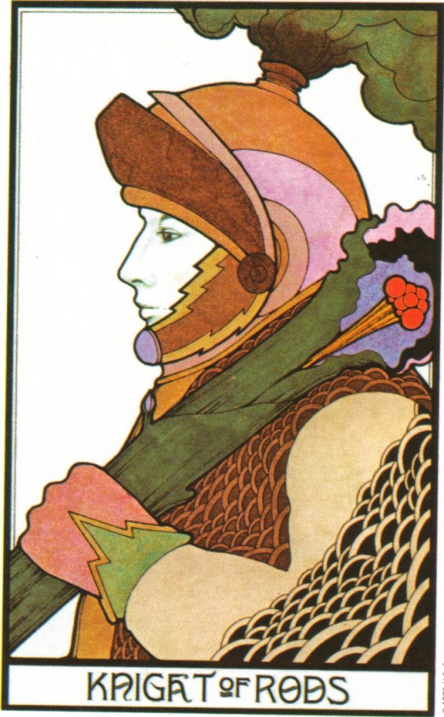
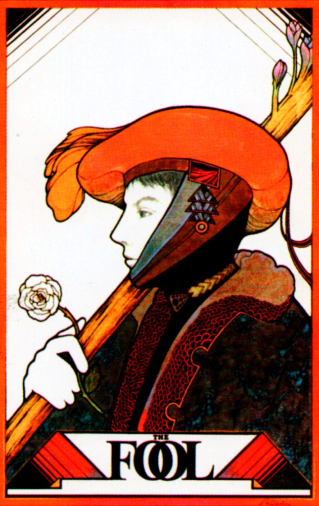
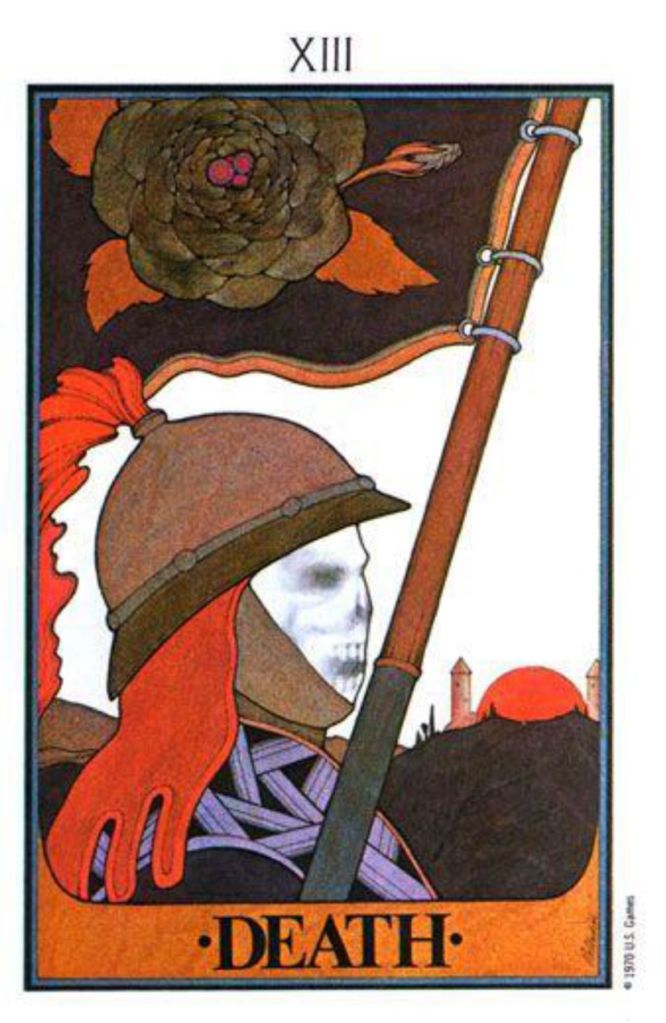
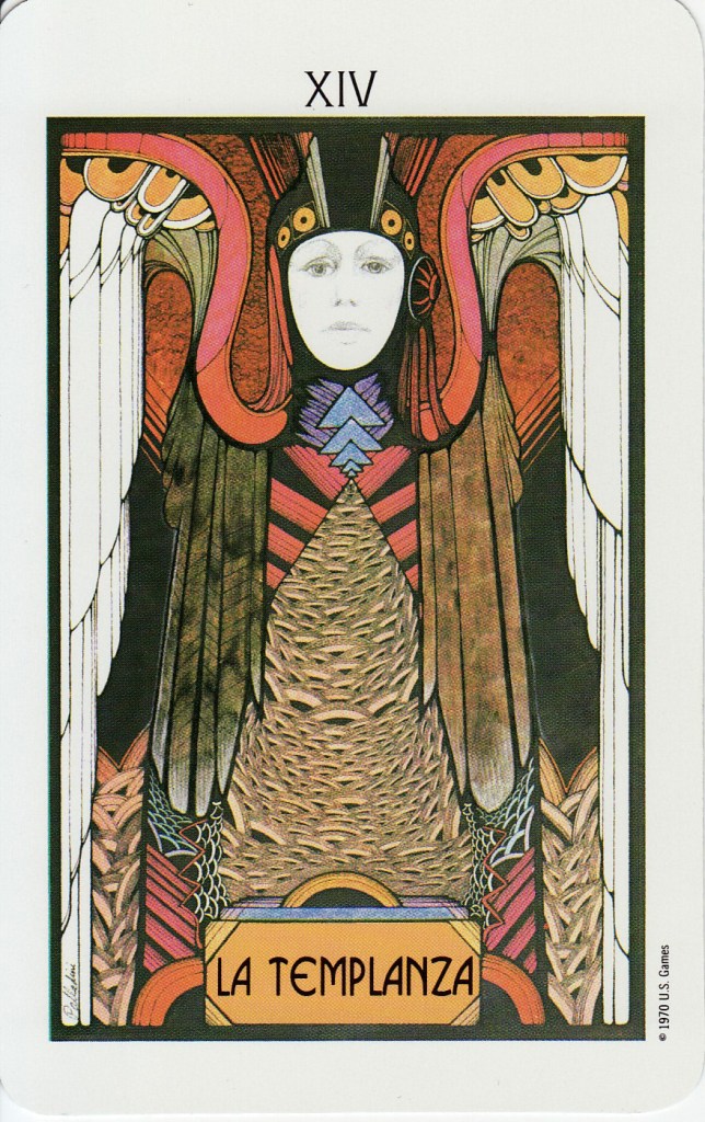
Object Name: Aquarian Tarot Deck
Maker and Year: David Palladini, Morgan Press, 1970
Object Type: Tarot Cards
Image Source: Graphicine
Description: (Richard McKenna)
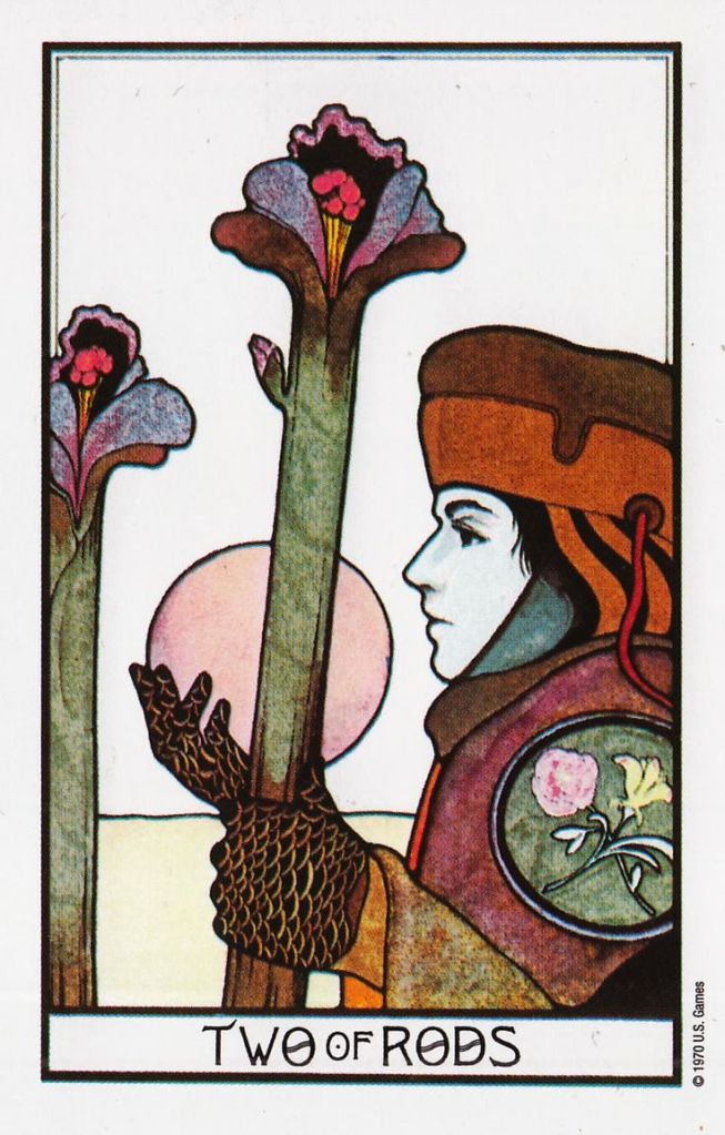
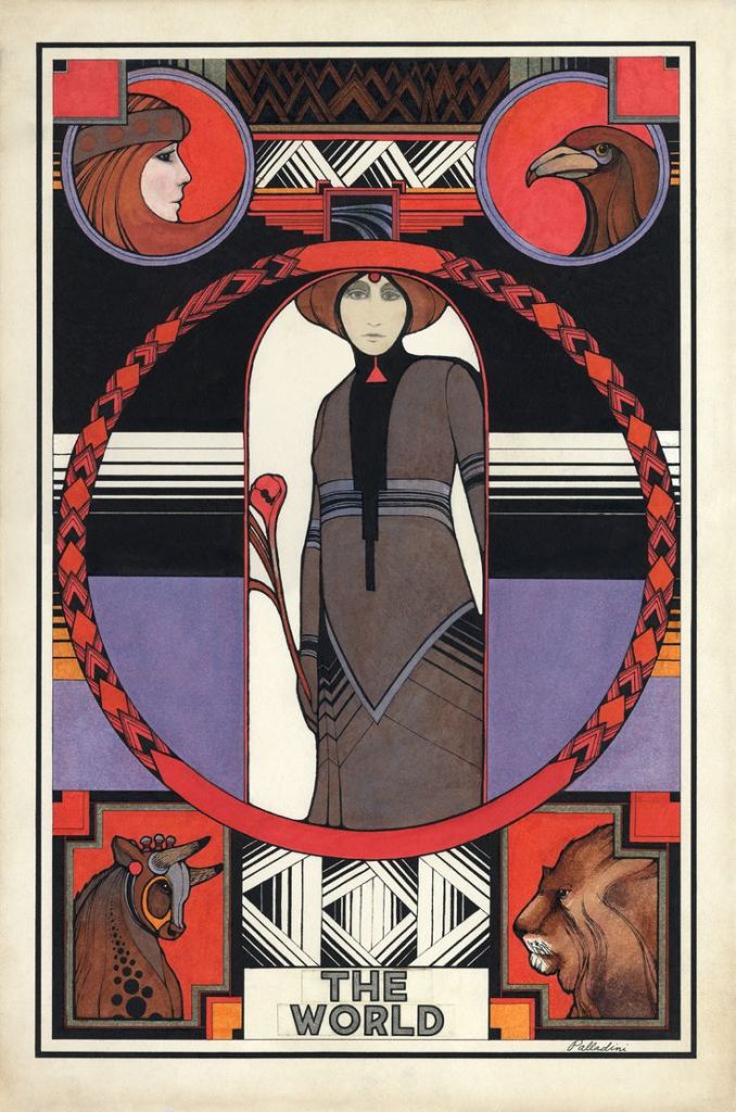
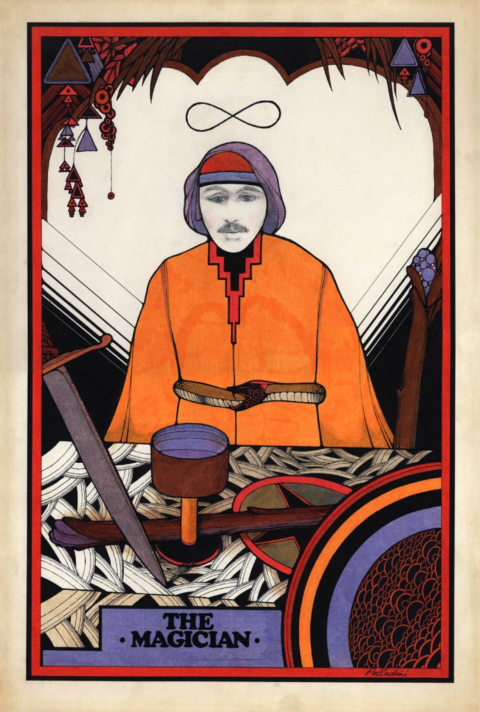
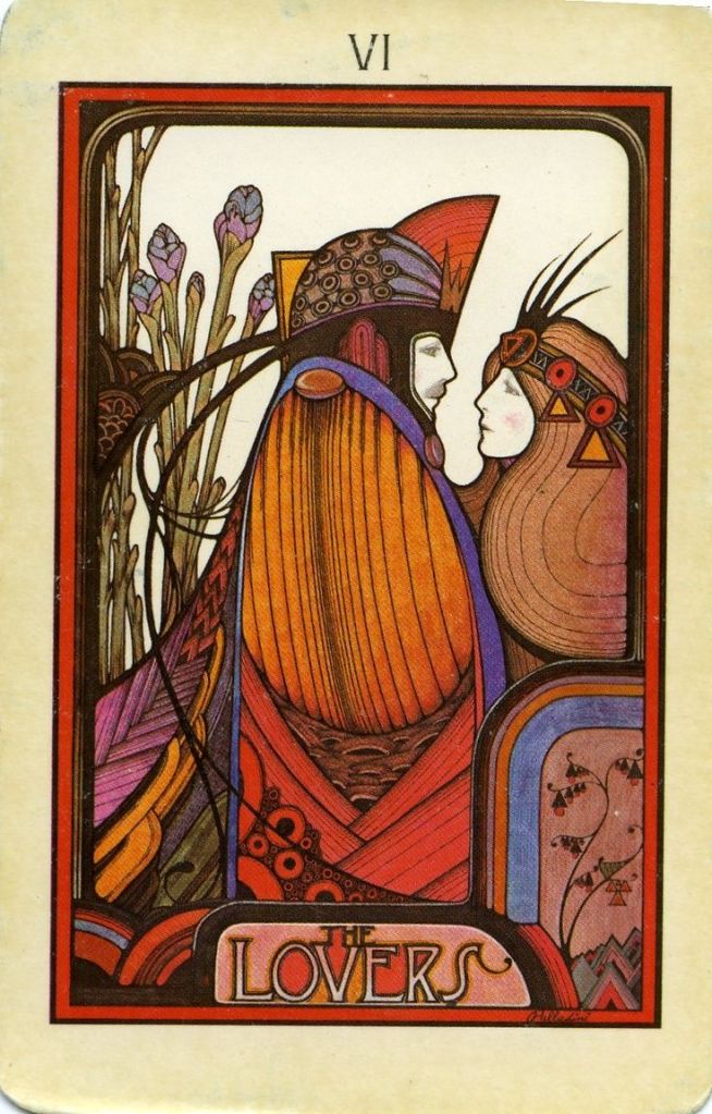
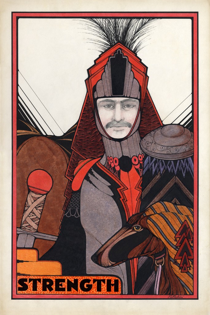
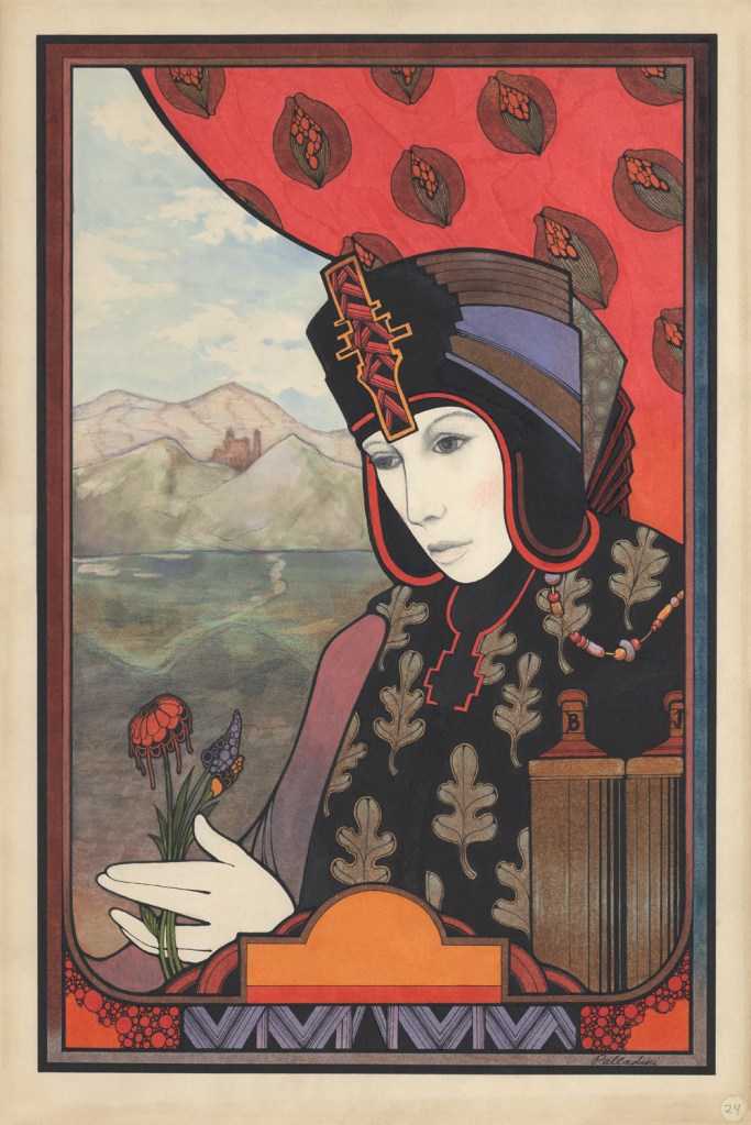
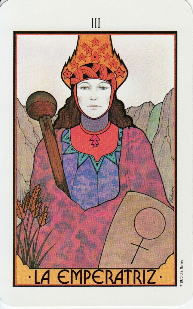
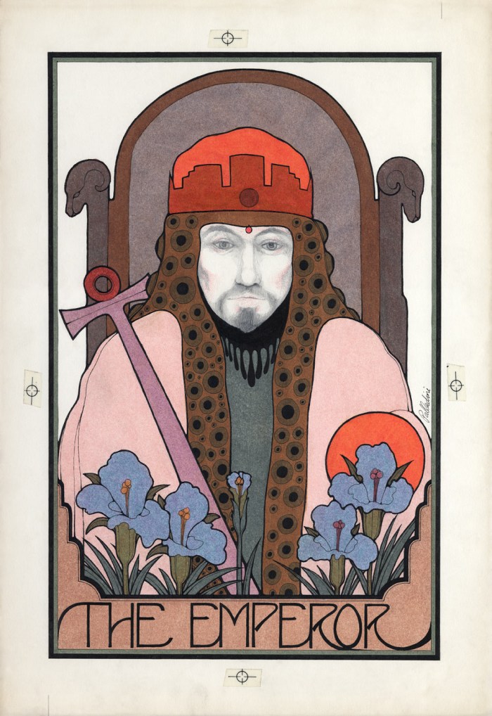
With their autumnal hues and deft fusion of the geometries of Art Nouveau and Art Deco, the tarot cards illustrated by David Palladini and published in 1970 by Morgan Press evoke perfectly the fading glow of the previous decade’s psychedelic optimism. The drift of interest in the esoteric and occult from the counterculture into the mainstream had been underway for some time: three years previously, Palladini had contributed to another pack of Tarot cards for Massachusetts paper producer Linweave and produced a series of Zodiac posters for Morgan Press. As well as Nouveau and Deco, Palladini’s style took inspiration from “decadents” like Harry Clarke and Aubrey Beardsley, the washed-out exoticism of illustrator Arthur Rackham, and even the expressionism of Munch, all filtered through memories of the early days of cinema and the poster art of the 1960s to create something that still looks modern today.
Palladini, who passed away in 2019, may be familiar from his illustrations for books like Jane Yolen’s 1974 book The Girl Who Cried Flowers and Other Tales, the 1987 edition of Stephen King’s The Eyes of the Dragon, and his remarkable, haunting poster for Werner Herzog’s 1979 Nosferatu. As his name suggests, Palladini came from an archetypal Italoamerican background—born in Italy in 1946, his family had emigrated to the United States in 1948 and settled in Illinois. After graduating from New York’s prestigious Pratt Institute Art School, which he attended on a scholarship, Palladini accepted a job as a photographer at the 1968 Mexico City Olympic Games. When the the chief poster designer abruptly departed, Palladini took over his post, creating a series of posters for the event. Once the Olympics were over, Palladini moved back to New York and took up a position with Push Pin Studios, then considered one of the most innovative illustration companies in the world.
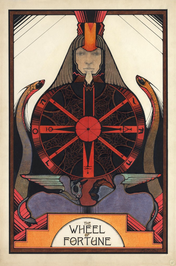
As an illustrator working in the New York of the 1960s and ’70s, it seems likely that Palladini would have been moving in the same circles as British illustrator Peter Lloyd, who would later work on the production design of 1982’s Tron. Looking now at these monochrome faces in their glowing geometric garments, it’s hard to avoid the conclusion that Lloyd and/or the other production designers of Tron must have been familiar with Palladini’s work. Shortly before Tron‘s release, echoes of the elegiac formalism of Palladini’s Tarot were also to be found in the uncharacteristically restrained artwork the brilliant Bob Pepper produced for this set of Dragonmaster cards in 1981: both packs channel an entire history of Western art from the Middle Ages on into beautifully cohesive imaginary worlds. And as these cards by Suzanne Treister show—published 48 years after the publication of Palladini’s deck—Tarot continues to enjoy a position of importance in the countercultural pantheon.


Pingback: “Become a Good CBer”: Citizens Band Radio Service Rules, 1978
Pingback: | Red Army Screaming
Pingback: Friday January 19, 2024 | The Very Now