Exhibit / June 20, 2017
-

- 1982
-
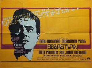
- 1970

-
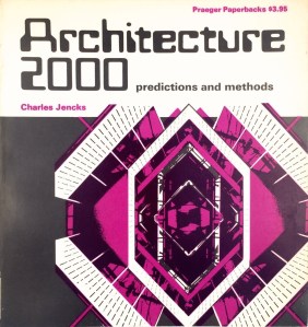
- 1978
-
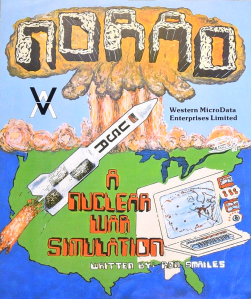
- 1981

-
- 1971
-
- 1968

Object Name: Westminster typeface
Maker and Year: Leo Maggs, 1964/1965
Object Type: Typeface
Description: (Richard McKenna)
Together with Bob Newman‘s perhaps better known 1970 typeface Data 70, the Westminster typeface represented a significant shift in the intrusion of the digital world into the real one, and still remains a potent and evocative symbol of futurist aspirations and fears. Despite its aura of austere modernity, the origins of the typeface actually lay in the altogether more cozy middle-class environs of About the House, the magazine of the Friends of London’s Covent Garden Opera House. Westminster was the work of Leo Maggs, a designer who was then working for Hazell Sun Group’s design studio and who, “probably in 1964 or 1965,” was asked to produce a “futuristic” font for an article in the publication.
As inspiration, Maggs used the magnetic ink character recognition font MICR E-13B, which was used with the first automated cheque-processing system. Possessing only 14 characters (the numeric digits plus four control symbols), MICR E-13B had been developed in the mid-1950s by the Stanford Research Institute (later involved in investigating psychic phenomena such as clairvoyance, ESP, and precognition) and the General Electric Computer Laboratory as a machine-readable font capable of resisting marking and mutilation. After completing the job, Maggs went on to complete the alphabet—which was originally composed of only upper-case characters—in his free time, and presented the finished product to instant lettering company Letraset, which rejected it on the grounds that it was “commercially unviable.” Westminster was eventually produced by London photo-typesetting company Photoscript Ltd., a possibly apocryphal legend claiming that it took its name from the UK’s now defunct Westminster Bank.
Although to some extent eclipsed by the more versatile and streamlined typefaces it inspired, like the aforementioned Data 70 (with its uniform left-hand slab) and others like Stan Davis‘s 1967 Amelia and Colin Brignall‘s 1965 Countdown (which made more explicit the counterculture-driven blurring of lines between functionality and aesthetic also visible in fonts like Tony Wenman’s 1972 Bottleneck), Westminster was still relatively ubiquitous as a signifier of techno-modernity in the late 1980s, its bottom-heavy heft, which lent itself perfectly to a psychedelic reading, having proved hugely influential.


Pingback: The Bruton Music Library, 1977 – 1989
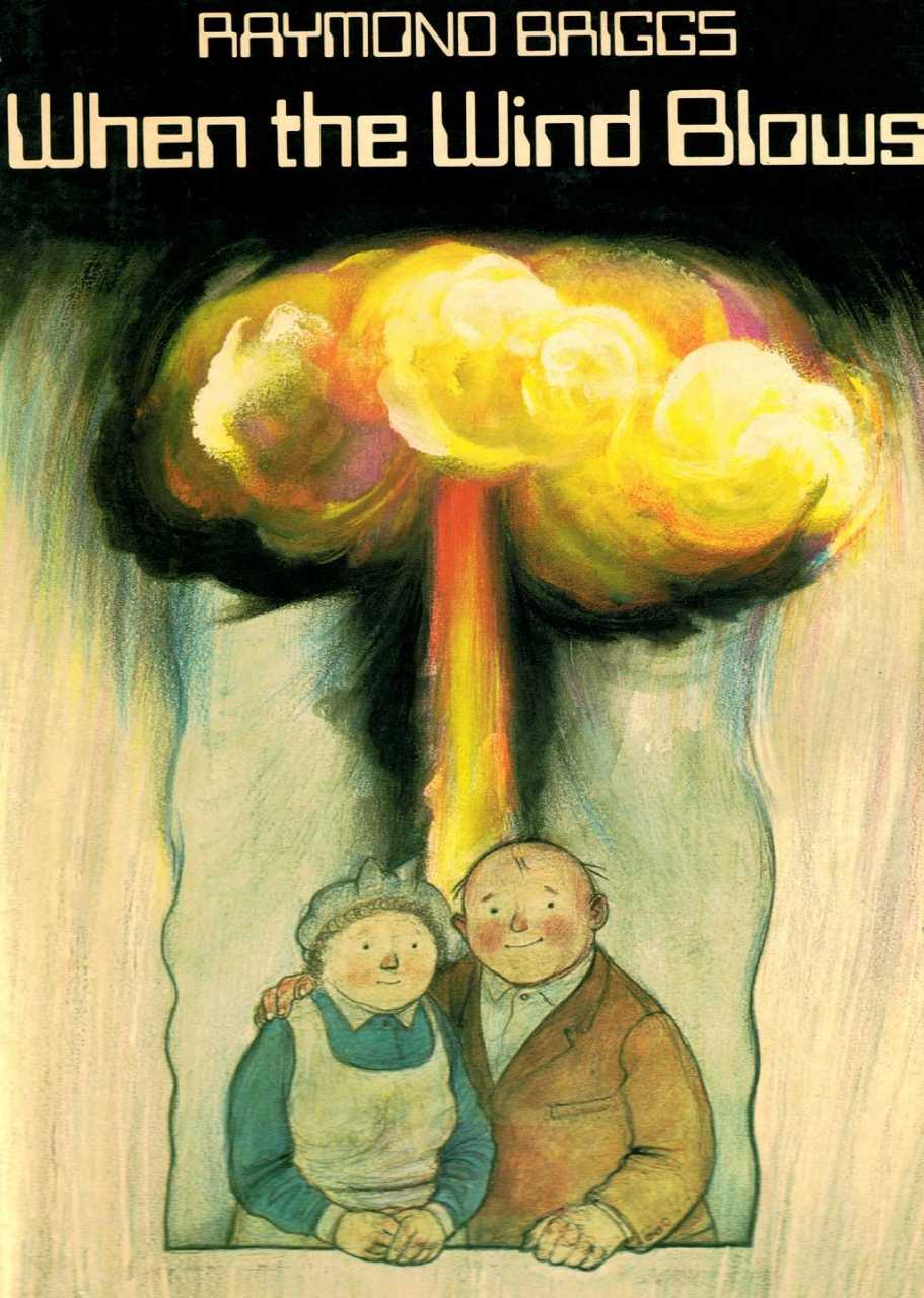
Pingback: The Uncoziest Catastrophe: Raymond Briggs’ ‘When the Wind Blows’, 1982