Exhibit / September 19, 2017
-

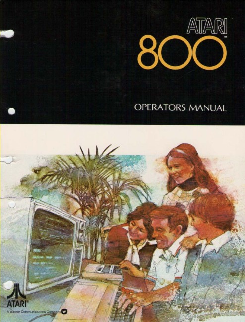
- 1979. Illustrator: unknown (after Cliff Spohn)
-

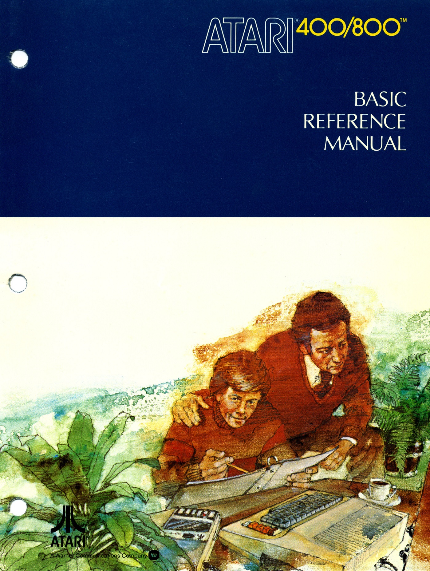
- 1979. Illustrator: unknown (after Cliff Spohn)
-
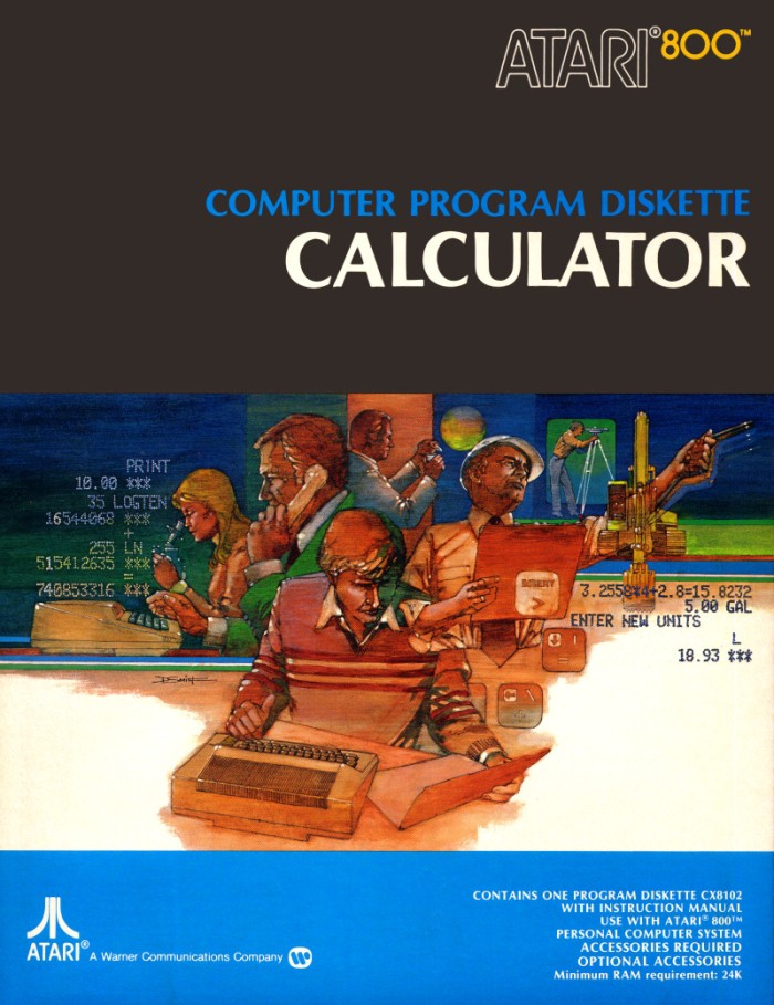
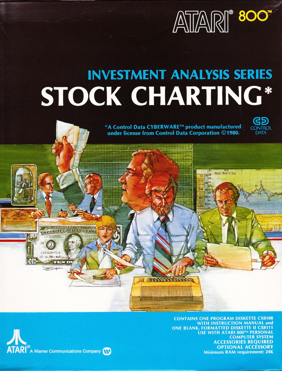
- 1979. Illustrator: D. Smith
-

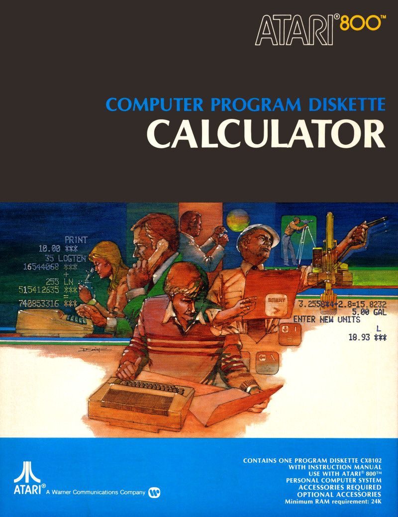
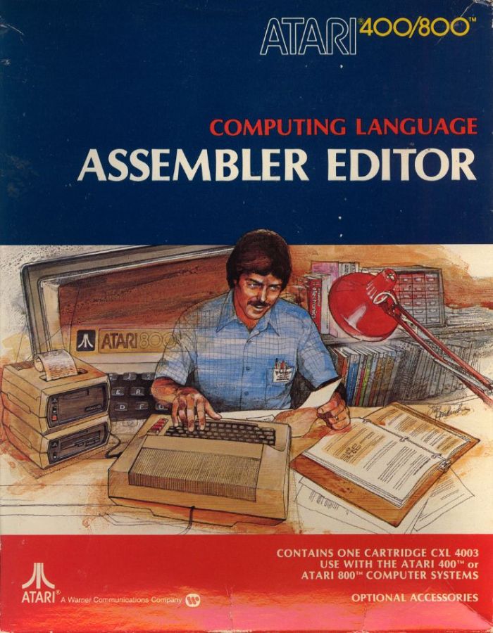
- 1981. Illustrator: D. Smith
-
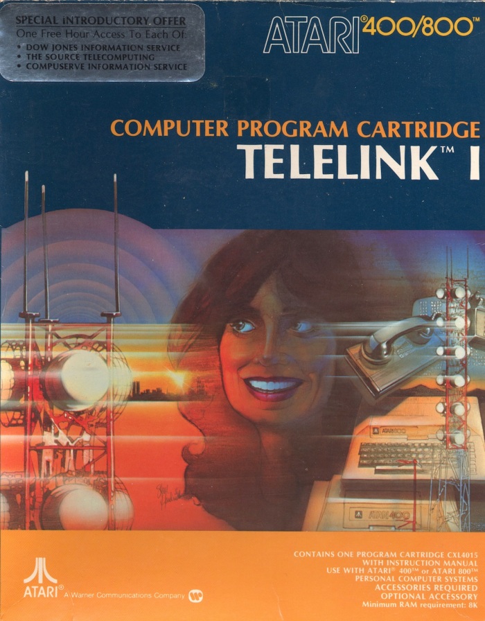
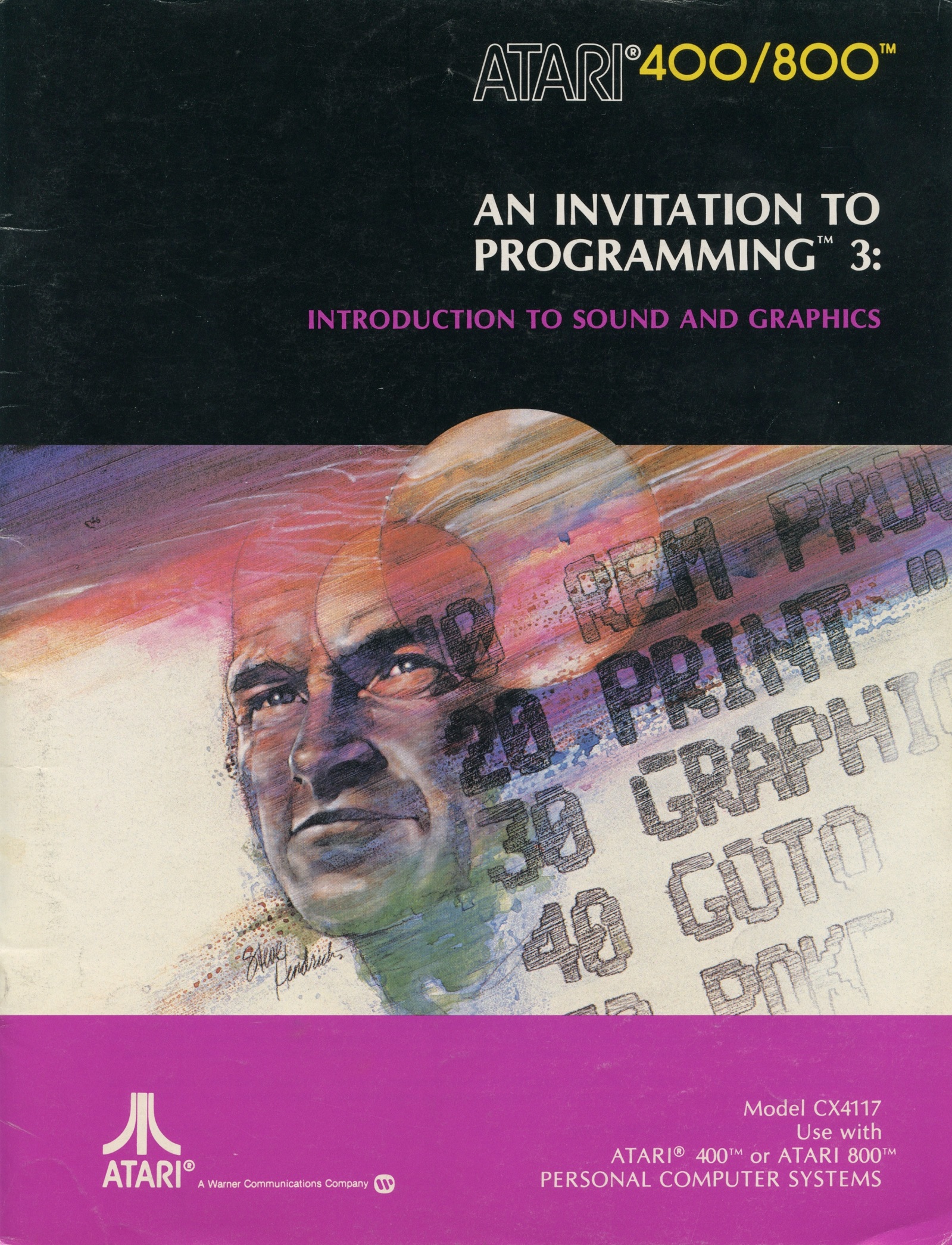
- 1980. Illustrator: Steve Hendricks

-
- 1981. Illustrator: Steve Hendricks
-

- 1981. Illustrator: Steve Hendricks
-

- 1981. Illustrator: unknown
-
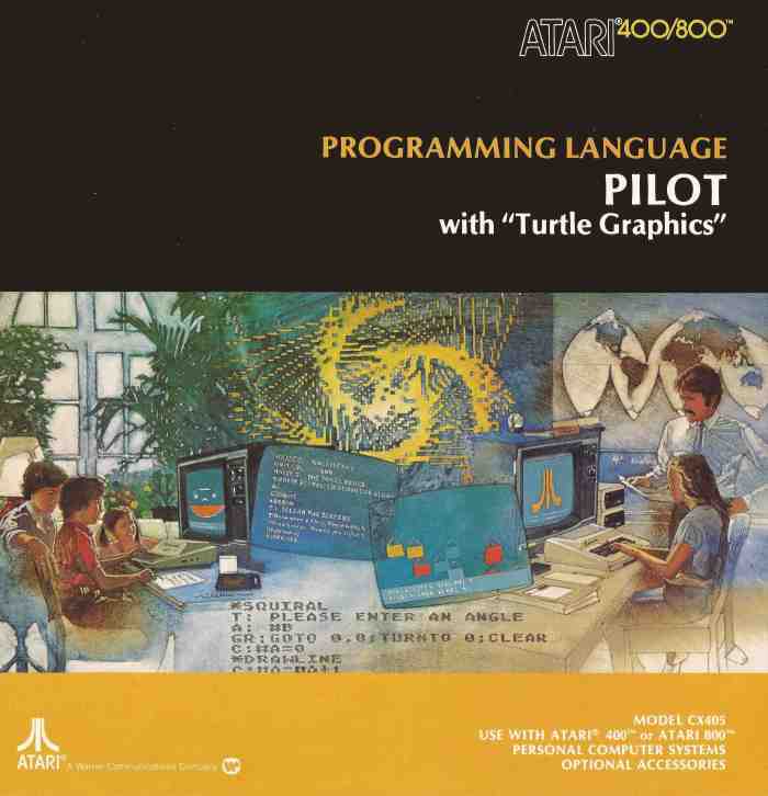
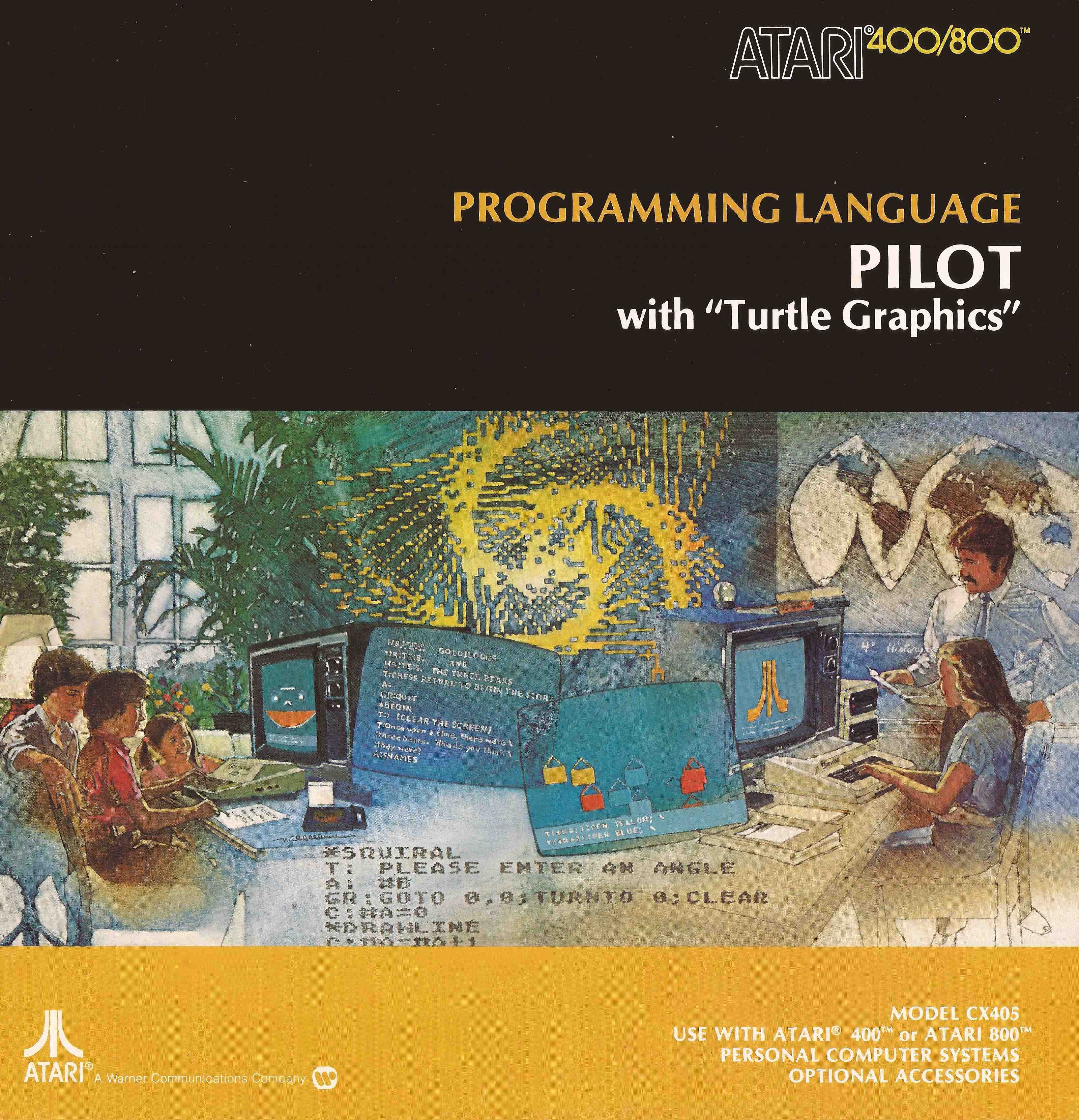
- 1981. Illustrator: Michel Allaire
-

- 1981. Illustrator: Steve Hendricks
-

- 1981. Illustrator: unknown
-

- 1979. Illustrator: Rick Guidice
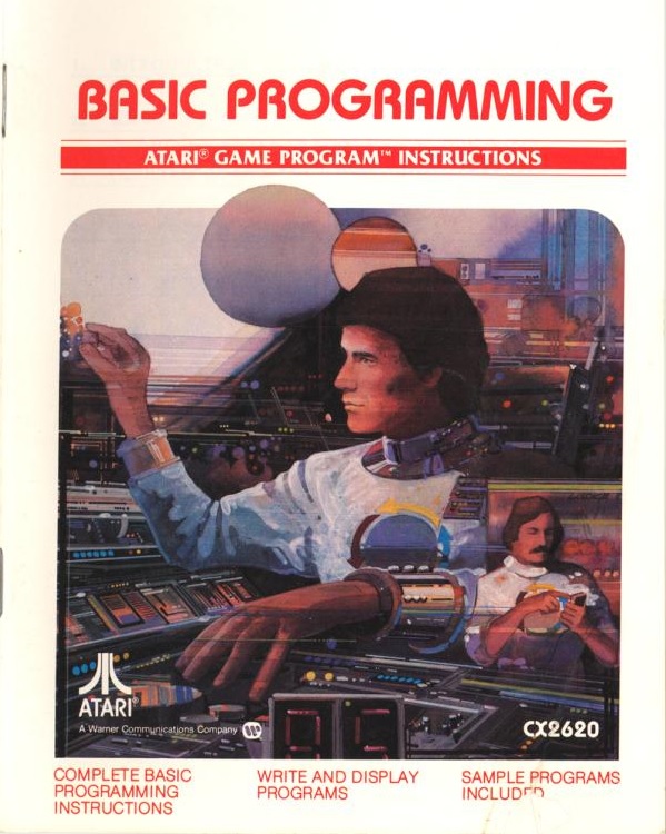
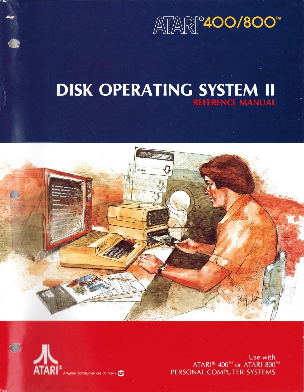
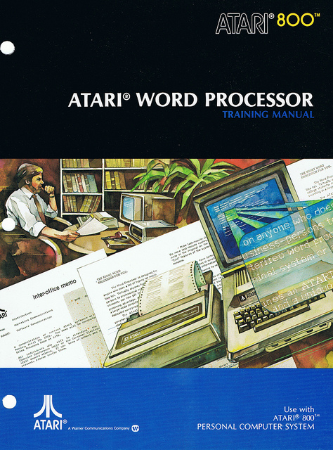
Object Name: Atari 400/800 program boxes and manuals
Maker and Year: Atari, Inc., 1979-1981
Object Type: Computer program boxes and manuals
Image Source: Atari Age, Atari Mania, Internet Archive
Description: (K.E. Roberts)
The cover art featured on the boxes and cartridges of Atari games from the company’s heyday—the late ’70s through the crash of ’83—has been much admired and discussed, and rightly so: video games were an upstart medium, and Atari president Nolan Bushnell felt that the packaging “needed all the care and attention that a record album did.” What’s not talked about is the exceptional artwork provided for “utilities” programs and operational manuals. Illustrating the action of games like Missile Command and Asteroids is pretty straightforward, after all, but how do you dramatize a spreadsheet, or a Disk Operating System, or the terribly obscure (at the time) concept of microcomputer programming?
Cliff Spohn developed what would become Atari’s house style in 1977, after Atari hired him to illustrate the cover of Combat, the game that was included with purchase of the new Atari Video Computer System (VCS), released in September of the same year. Spohn would go on to illustrate 20 Atari VCS (later renamed the Atari 2600) game covers, as well as the interior of the original Atari 800 Operators Manual from 1979 (some of Spohn’s illustrations here were slightly revised and used as the covers for later manuals). Later artists were instructed to emulate Spohn’s style to maintain the excitement and continuity of the brand. The style itself—a realistic expressionism achieved through blurring borders and the “washing out” of textures—had been gaining popularity in commercial art since the late 1960s, especially on the covers of pulp paperbacks. Spohn cites David Grove, best known today as a movie poster illustrator, as a major influence, but there were many others.
The first thing you’ll notice: a plethora of ferns. Unlike video games, which had to capture the imagination of kids, Atari computers and their “serious” accessories were marketed to adults, and the fern in the late ’70s and early ’80s, much like the Aspidistra in Victorian Britain, was a symbol of middle-class virility and respectability. Other cultural and class cues are also evident: a pipe on the desk of the pensive and all-business word processor, a diamond ring, a pocket protector, a balanced-arm lamp, a cup of coffee on a saucer. The “action montage” used to perfection by Spohn to animate Atari’s game library is also seen here: the art for the Calculator program includes an optical level (for land surveying), a construction foreman, a crane, a microscope, and what appears to be a well-dressed man mixing a chemical solution—not to mention the preppy peering intensely into an empty manila folder.
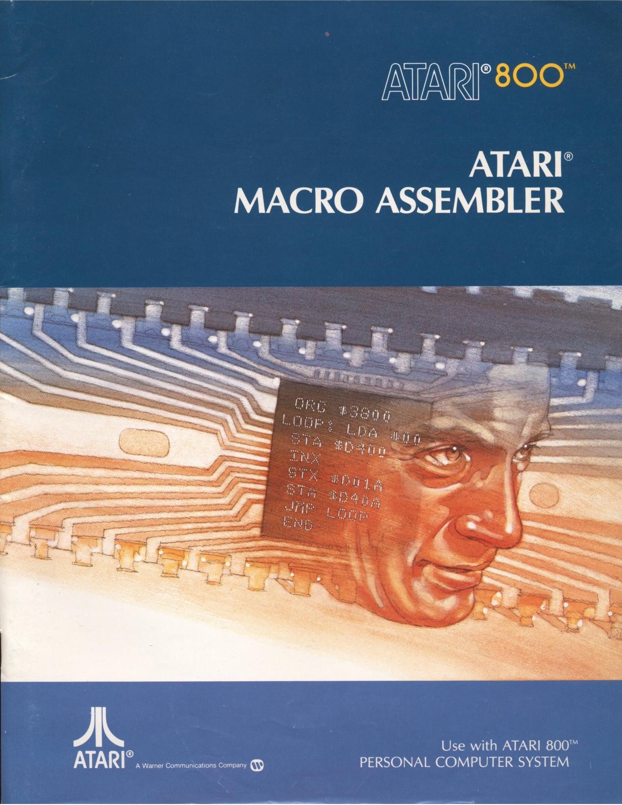
When it comes to programming, things become more abstract. Atari’s Macro Assembler features a disembodied head—tellingly, one with a double chin—floating amidst the surface of a microchip, and there’s another middle-aged noggin on An Invitation to Programming 3, this one colliding with and possibly absorbing the power of a Jupiter-like planet. The colors are of the outer rim, and the graphite text is scintillating. Possibly the definitive programming illustration is one that appears on the cover of the Atari 2600 BASIC Programming (1979) cartridge. The work here is by Rick Guidice, who was hired by NASA in the mid-1970s to immortalize various missions, as well as produce space colony concepts for NASA Ames. From there he came to the attention of Atari, where he did the covers for Space War (1978), Canyon Bomber (1979), and others. BASIC Programming is based on an earlier design he used for a NASA promotional brochure. Showing a young man at the helm of a massive spaceship control system, it gives us an idea of the promise offered by the technology at the time—a promise that could not break free of the grasping egos that gave it life.


Beautiful artwork, and always inspiring to me as a young programmer!
It was hard limiting the images to 12. There are a lot more out there. Maybe I’ll do a part two?
I totally remember this art, even though I held out until Atari released the 800XL.
The thing that strikes me the most about these illustrations is the fact that these were all done before the age of Photoshop and any kind of digital desktop publishing and design. Since I’m both an illustrator and I also work in the design industry, I know how much work that stuff takes. It’s hard enough to make a nice, blended and cohesive montage in Photoshop layers, so for guys like Spohn and Guidice to pull it off from scratch (i.e., watercolor, markers, ink pens, gouache, airbrush, and other traditional media) completely blows my mind. I can’t even imagine how long it took for them to do each piece. I wonder how big the originals were? Do any of them survive? I imagine them stacked in some attic and forgotten…if I had a man cave, I’d want those as huge floor-to-ceiling wallpapers…
I got reminded of a co-worker of mine, who worked for Tower Records back in the ’80s and did several album art billboards for the exterior of their infamous Hollywood store on Sunset Blvd. (it’s no longer there). He did each one purely by airbrushing, basically copying the album art desired. I think each one had to be at least 4×4 or even larger. He kept each one afterwards, and then eventually just tossed them because there was no demand for them in the traditional media lull of the ’90s. So when he told me this story relatively recently, it was a total face-palm moment for me. Oh well, what can you do.
Pingback: Great Movies, No Cables: ON TV Subscription Television, 1977 – 1985
Pingback: “What’s Inside the Little Box?”: Betamax Sales Demo, 1977
Pingback: “A Totally Different Experience”: Atari Theatre Kiosk Brochure, 1976