Exhibit / September 18, 2018
-

- Table of contents of U&lc’s first issue, 1973. Note the story on ITC’s Avant Garde font on page 4.

-

- Mission statement from U&lc’s first issue, 1973.

-

- Advertisement for an Addressograph Multigraph phototypesetter from U&lc Vol. 2 No. 1, 1975. Dynamic typesetting technology like this was becoming increasingly available to smaller businesses in the 1970s.

-
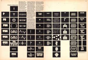
- Examples of Lubalin, Smith, Carnase, Inc.’s work for the Public Broadcasting System, U&lc Vol. 2 No. 2, 1975. “[F]or Public Television, the meaning and the drama are communicated clearly and effectively by having the title typography itself illustrate the nature of the show.”

-

- U&lc presented a report from Vision ’77, a conference held at the Rochester Institute of Technology about the future of design and communications, in Vol. 4 Nos. 3 and 4.

-

- Vol 4. No. 3 in 1977 also featured an interview with Saul Bass and a look at his era-defining work in logo design and film

-

- Introduction to U&lc’s “Vision ’80s” feature, U&lc Vol. 7 No. 2, 1980, which took the form of an abecedarian “A-Z” index of quotes from artists and writers about creativity.
-
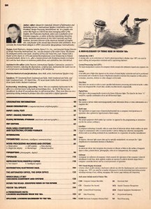
- Table of contents and glossary for “Vision ’80s” issue, U&lc Vol. 7 No. 2, 1980. Short biography of Edward Gottschall in upper-left corner. Elsewhere in the feature, the magazine notes, “Who knows, perhaps Vision ’90s will reach you electronically.”

-

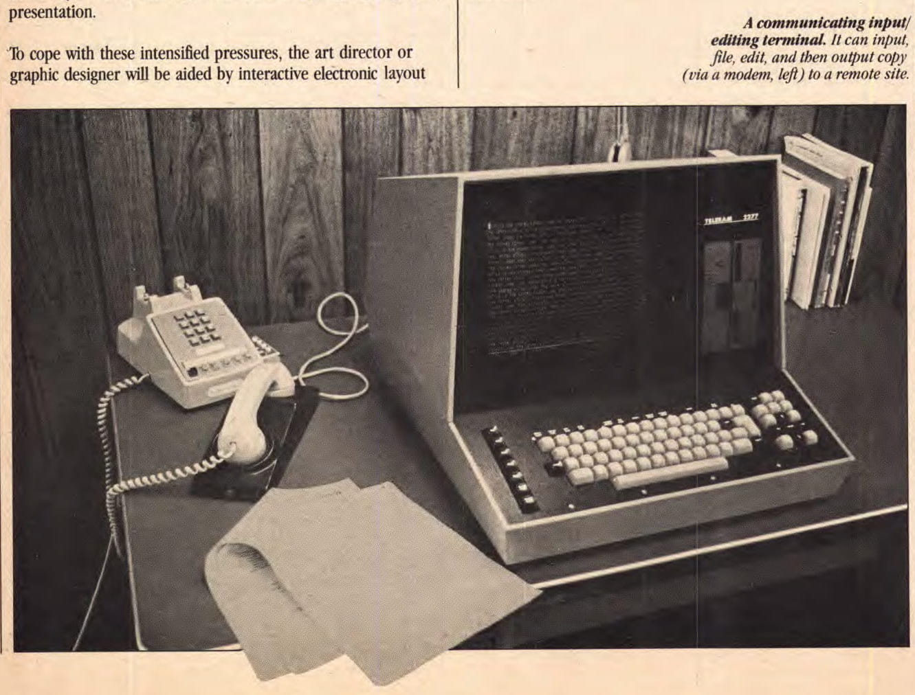
- Here a glimpse of new technology about to roil the typographic industry is displayed: telecommunications uniting with the personal computer revolution.
-
- Apple Computer’s Lisa computer was considered a gamechanger for graphic designers and typesetters in 1983 due to its innovative real-time display, but poor sales performance would put dreams of desktop publishing back on the shelf until the mainstreaming of Apple’s Macintosh later in the 1980s.

-

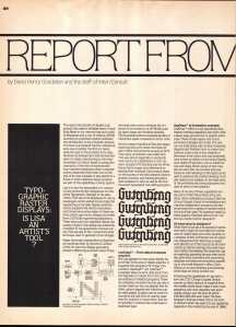
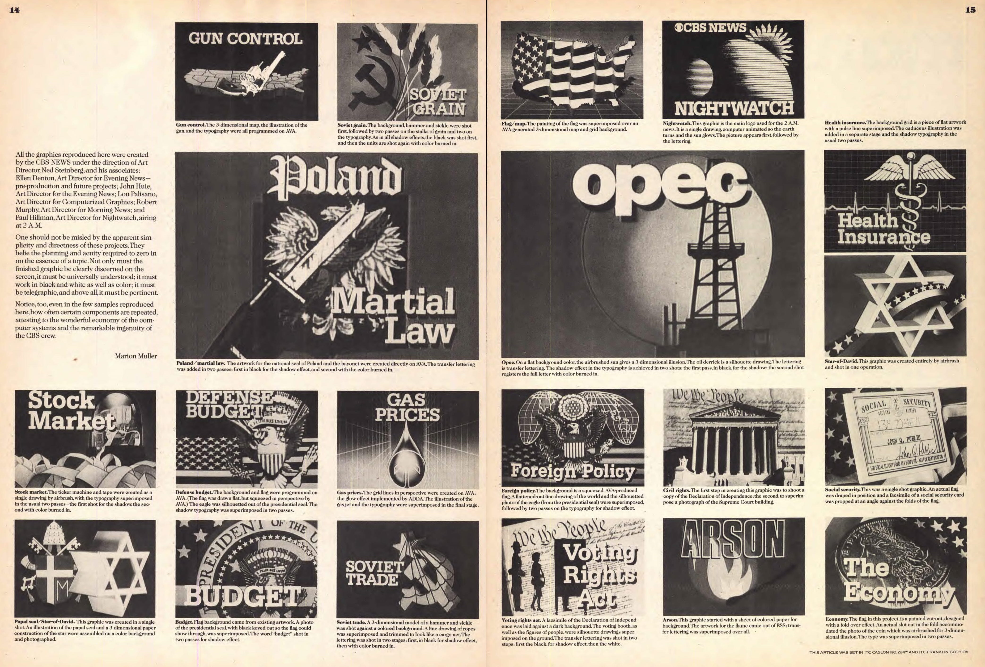
- Also from Vol. 10 No. 2 of U&lc from summer of 1983: a feature on how CBS creates graphics for their news programs; as video synthesizer technology became cheaper and easier, TV network graphic departments could create attractive graphics with little lead time.
Object Name: U&lc (Upper & Lower Case, The International Journal of Typographics) magazine
Maker and Year: International Typeface Corporation, 1973-1999 (print version)
Object Type: Magazine
Image Source: U&lc archive at fonts.com
Description (Michael Grasso):
International Typeface Corporation was a private company founded in 1970 to take typesetting out of the physical, metal-setting world and into more “virtual” spheres like filmsetting and the nascent world of computer typesetting. For over a quarter-century starting in 1973, ITC released its own print journal, called Upper & Lower Case, or U&lc. Alternately playful and forward-thinking, U&lc combined visually dynamic articles on typesetting history, newly-designed typefaces, award-winning uses of typography in print and television advertising, and graphic design with portentous pieces on the coming computer typesetting revolution.
The writing was on the wall in the 1970s for typesetters and old-fashioned typographers, and U&lc was assiduous in its efforts to prepare the industry for the sweeping change to come. In the June 1980 issue, editor Edward Gottschall presented a lengthy feature called “Vision ’80s” that introduced the basics of personal and business computing to a community that was about to be utterly revolutionized by new technology. Throughout the ’80s, more and more articles on the coming transformation of publishing appeared, containing repeated warnings for the traditional typesetting and graphic design communities to get onside with computers as soon as possible. U&lc‘s print version was itself inevitably a casualty of the move from traditional to computer-based publishing; the final print issue was released in the fall of 1999.
The founders of ITC and U&lc, Aaron Burns, Herb Lubalin, and Edward Rondthaler, combined their future-facing philosophy with a deep and abiding love of the typesetting aesthetic of the early 20th century. This was part and parcel of an overall rediscovery of Deco style in the 1970s. They resurrected older fonts for the nascent digital age, and developed new fonts inspired by the Deco period. One of Lubalin’s most enduring creations was ITC Avant Garde, which was colossally popular in the 1970s and appeared everywhere from logos for Macy’s, Bloomingdale’s, and adidas to the Public Broadcasting Service’s 1970s logo and ident (which were designed by Ernie Smith and Lubalin).
The U&lc archives now freely available on fonts.com are a hugely important resource for students of the history of typography and graphic design. Allan Haley, a longtime contributor and editor of U&lc, penned introductions to each publication year archived on the site. ITC’s legacy is clear: many of the fonts that you use on your personal computer were created and designed by ITC a decade or more before typography-capable PCs were on any designers’ desks.


Pingback: You Can Gouge Away: ‘Vaughan Oliver: Archive’ and the 4AD Aesthetic
Hi
I have about 20 U&LC Journals. in good condition that I would like to give to a good home at no charge with free shipping/
Anybody interested?