Exhibit / September 19, 2018
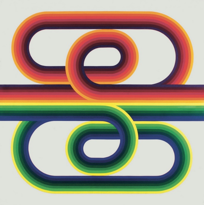
Object Name: La Longue Marche
Maker and Year: Julio Le Parc, 1974
Object Type: Painting
Image Source: Galerie Perrotin
Description: (K.E. Roberts)
A significant figure in the development of op art and kinetic art, Argentinian-born Julio Le Parc attended the School of Fine Arts in Buenos Aires before moving to Paris on a French government scholarship in 1958. Le Parc was influenced by the Asociación Arte Concreto-Invención (an Argentinian concrete art collective) and Lucio Fontana’s Spatialism, and he experimented throughout the 1960s with mobiles, reflected light, mirrors, geometric installments, and other forms that captured movement and “unpredictability” and demanded spectator interaction. Le Parc, a lifelong leftist and social rights activist, was expelled from Paris after working with the Marxist student group Atelier Populaire during the May 1968 uprising.
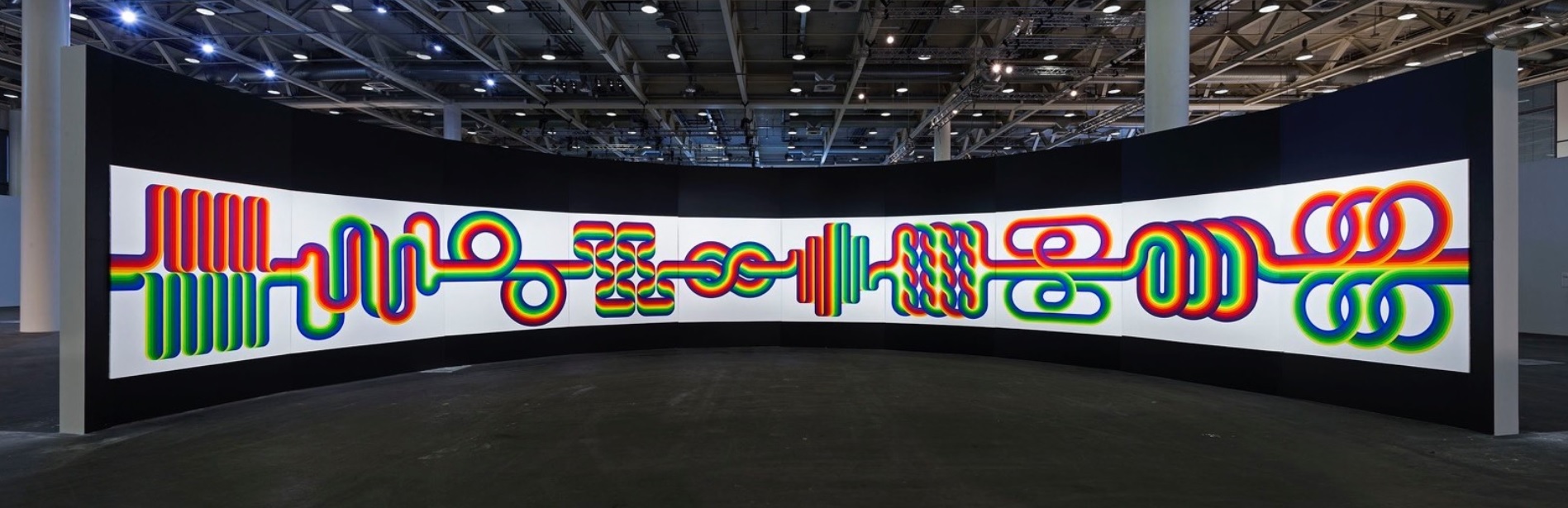
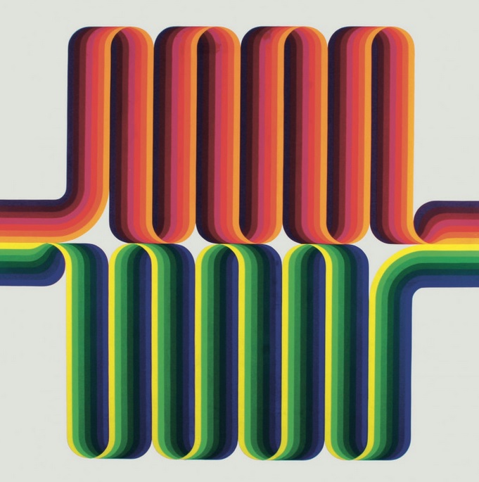
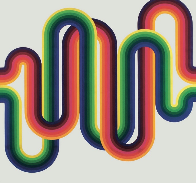
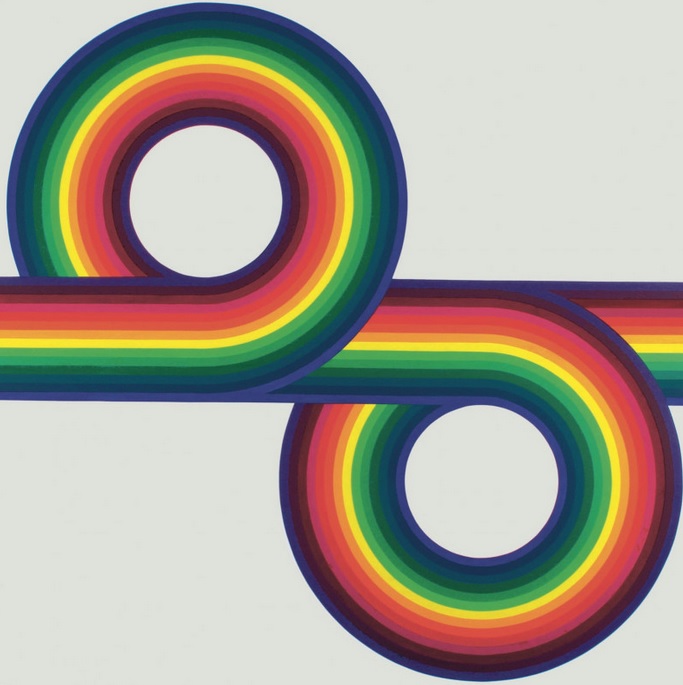
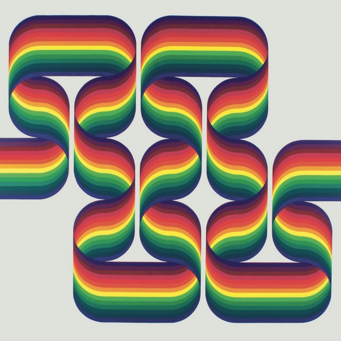
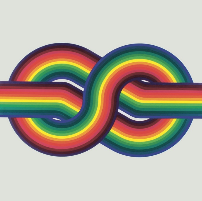
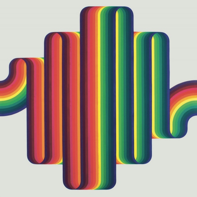
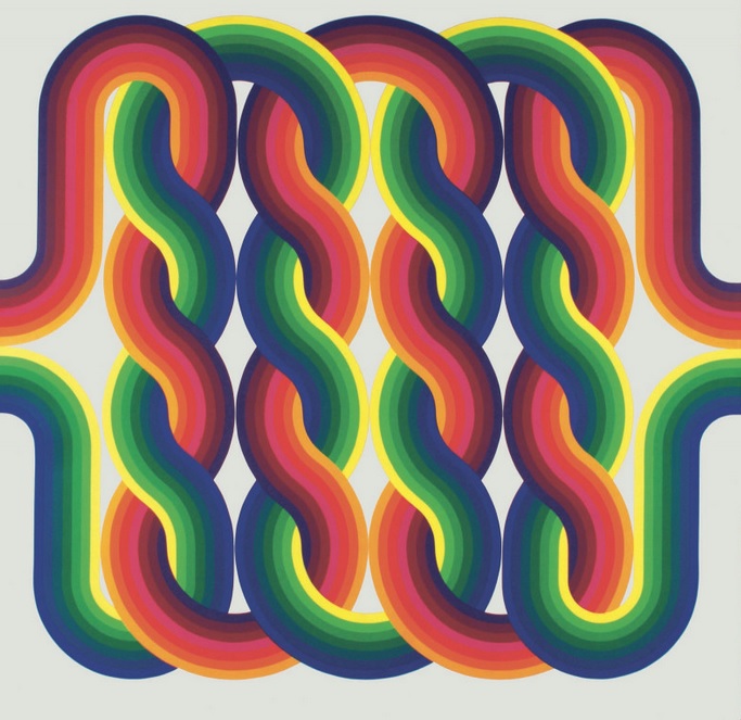
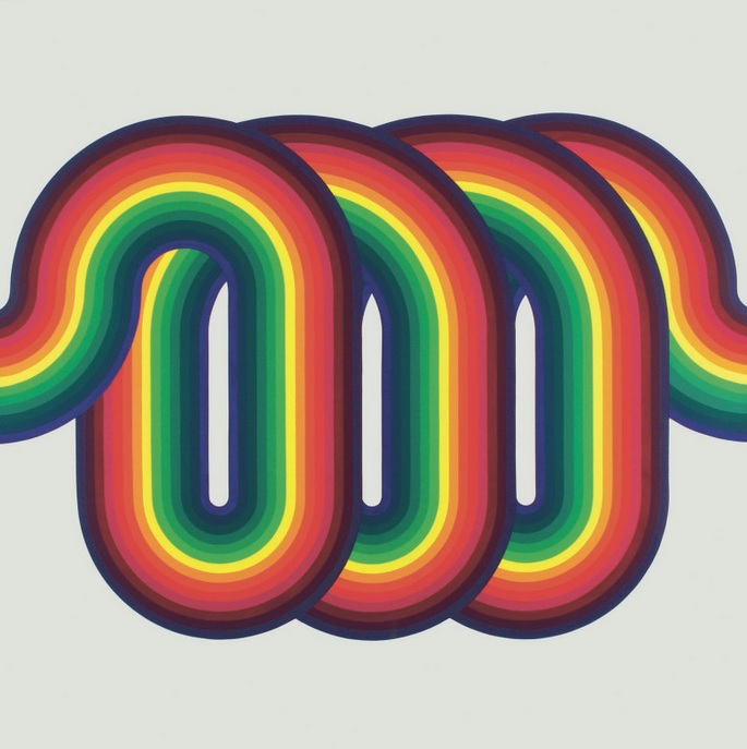
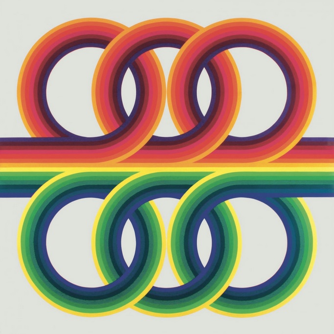
La Longue Marche (The Long March) was completed in 1974, two years after Le Parc refused a retrospective at the Museum of Modern Art in Paris (according to legend, the decision was based on a coin toss). The work consists of 10 separate but integrated panels featuring interweaving braids of vibrant prismatic color, and stretches to more than 65 feet in length. The artist described the painting to Galerie Perrotin:
My long march began when I was a child in a tiny village. I used to go out to the edge of the village, to the desert. I always looked out to there, the sun was rising, that is to say, to the east. I looked to the other side, where I could imagine the sea being. I had no idea that one day I would travel a thousand one hundred kilometres to reach the sea, to cross the Atlantic, to come to France and develop things there. That is my long march. But the end of this long march is not when I die. This long march will continue. It is then, a metaphor for the human condition, but a happy metaphor.
Rainbow and prismatic color schemes had been gaining popularity in commercial illustration and graphic design since the mid-1960s, due largely to the counterculture’s taste for psychedelic imagery, as had the multi-line or “racetrack” stripe design: a few examples include this 1967 painting by Michael English for the UFO Club, Frank Glickman’s original Portland Trailblazers logo, Verner Panton’s 1971 design of the Varna Restaurant in Denmark, and Tony Wenman‘s influential 1972 font Stripes.
La Longue Marche gathers and synthesizes all of the elements of a radically changing culture—fluidity, flux, constancy, tension, hope—into an enigmatic new form. Le Parc’s utopian statement would, in turn, become an archetypal blueprint for the 1970s visual aesthetic, reflected in everything from custom vans, interior design, advertising art, and promotional stickers to travel guides and Gilbert Baker’s gay pride flag. “We wondered how we could change or invert the status quo,” Le Parc said in 2017, “and create a more direct relationship with people, without filtering things through aesthetic analyses, market value, and production.”


Pingback: Fiddle This: Yorkshire TV’s ‘Sounds Good’, 1985