Exhibit / March 22, 2018
-
- 1952
-

- 1958

-

- 1959

-

- 1956
-
- 1961

-
- 1962

-

- 1965
-
- 1967

-

- 1968

-

- 1970

-
- 1973

-
- 1974

-
- 1977

-

- 1980
-
- 1983

Object Name: Book and LP covers designed by Paul Bacon
Maker and Year: Paul Bacon, et al., 1952-1983
Object Type: Books and LPs
Description: (K.E. Roberts)
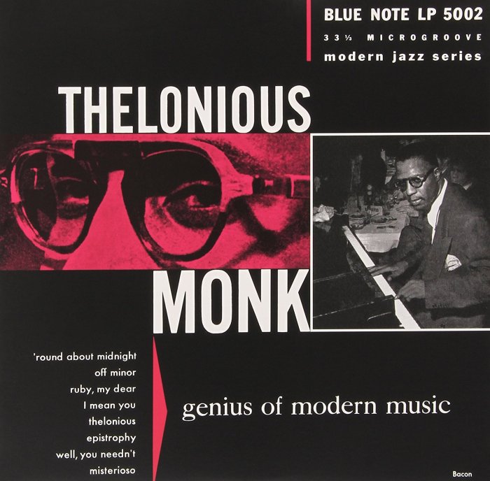
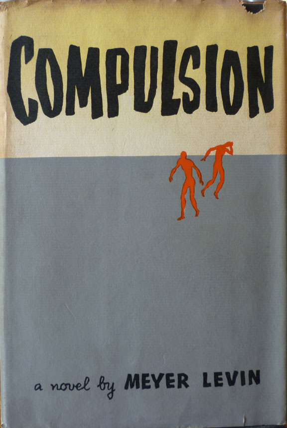
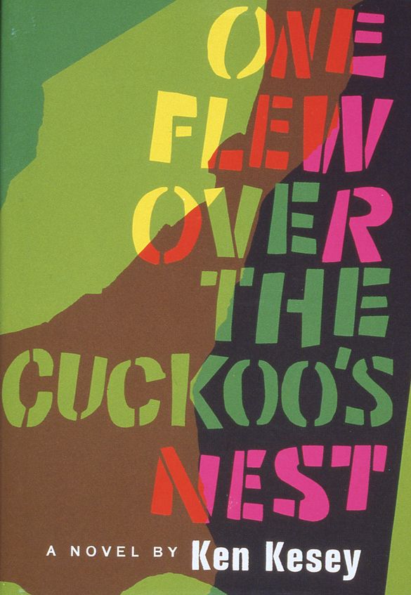
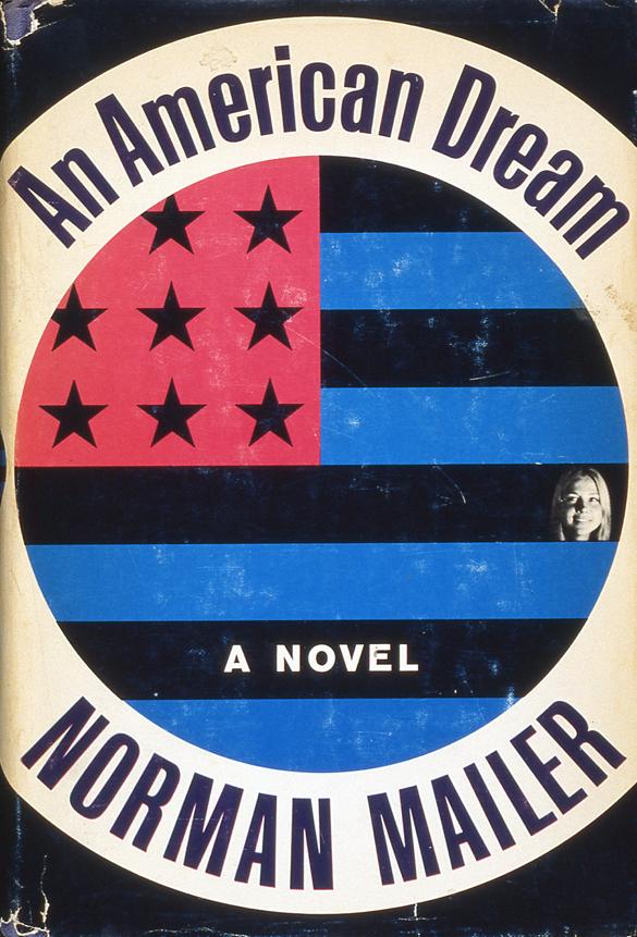
After serving in the Marines during World War II, self-taught artist and typographer Paul Bacon (1923-2015) landed in New York City, where he designed several now-famous album covers for jazz labels Blue Note and Riverside Records. Bacon had discovered jazz in the ’30s, and he remained a great fan—he was befriended by Thelonious Monk, among others—throughout his life. In 1950, at the request of a friend, Bacon provided interior illustrations and designed the jacket for Bill Westley’s Chimp on My Shoulder, about the author’s search for chimpanzees in Africa. This led to commissions from several other publishers, and his breakthrough came in 1956, when his cover design for Meyer Levin’s novel Compulsion ushered in the much-imitated “Big Book Look,” a concept defined by a large, stylized title and prominent author name accompanied by a minimalist figure or symbol against a spacious background—the visual equivalent of a jazz ballad solo.
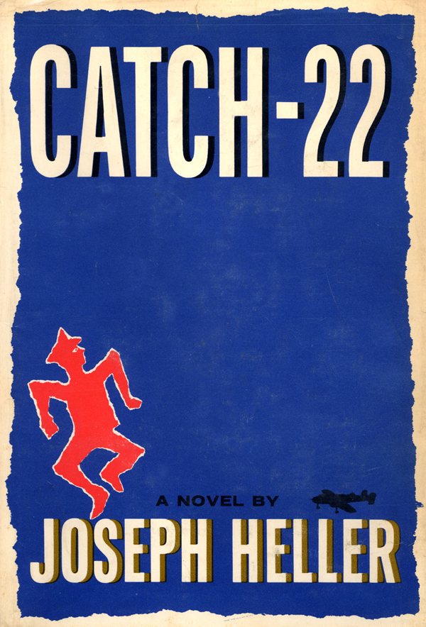
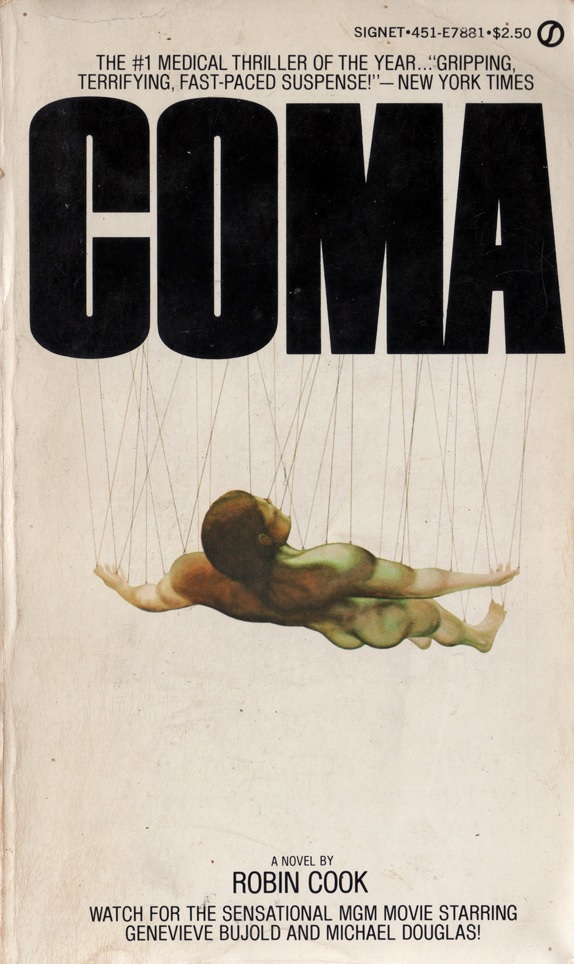
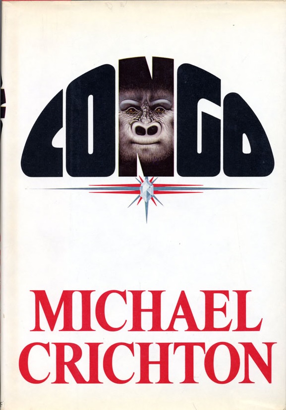
To follow Bacon’s career is to follow the trajectory of American publishing and American fiction. His high profile clients of the ’50s and ’60s—Joseph Heller, Kurt Vonnegut Jr., E.L. Doctorow, Philip Roth, Ken Kesey, Norman Mailer—were distinctly “literary,” while the bestselling authors of the ’70s and ’80s—Michael Crichton, Peter Benchley, Robin Cook, James Clavell, Thomas Tryon—were distinctly “genre.” None of that mattered to Bacon, who had no illusions about his role in the commercial process, whether the job was Slaughterhouse-Five or The Andromeda Strain: “You’re not the star of the show,” he said in 2002. “The author took three and a half years to write the goddamn thing and the publisher is spending a fortune on it, so just back off…”
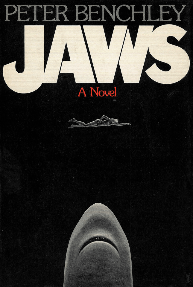
For the hardcover edition of Jaws, published by Doubleday, Bacon placed an abstract shark at the bottom edge of the jacket, the monstrous creature plunging upwards and seen from underneath, against a stark black background. A grey swimmer floats ominously in the blackness, unaware of the predator about to strike. A perfect evocation of the primal fears (some of them obviously Freudian) lurking at the heart of both the book and the film, the image nevertheless proved to be too contemplative for the paperback, released by Bantam Books. Roger Kastel, who later painted the film poster for The Empire Strikes Back, took Bacon’s idea and sensationalized it, adding more color and (literally) more teeth. Kastel’s version appeared on the movie poster as well, of course, and became one of the most recognizable and imitated pop culture symbols in the world.
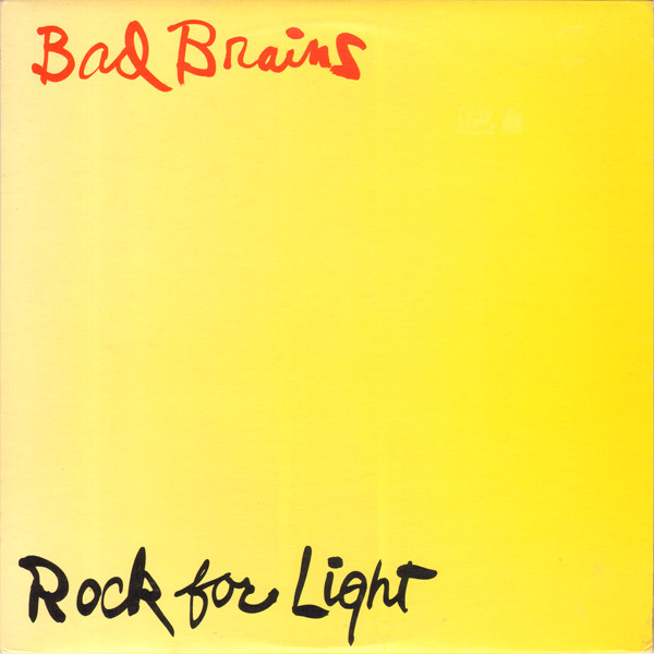
Bacon claimed to have read all of the 6,500 books he illustrated, but he steered clear of authors during the design process. In 1965, however, he made an exception. At the request of publisher Dial Press, Bacon rang up the notoriously pugnacious Norman Mailer, who complimented Bacon’s work before requesting that a photo of his then-girlfriend—it could be the size of a “postage stamp”—be inserted into the cover of An American Dream. Bacon graciously assented. “As it turns out,” he recalled in 2012, “it didn’t do it a bit of harm.” He continued to design album covers as well, off and on, into the ’90s, some of his last for pioneering hardcore punk outfit Bad Brains.


Mr. Bacon’s work is an outline for any artist longing for an incredibly inspiring career.